


JO’s Coffee // Ready to Drink Packaging
ProblemJo’s Coffee in Austin, Texas, has a fun and friendly brand with an active follow ready-to-drink marketplace. The challenge was to create an RTD product that looked in line with their current brand offerings while also standing out on the shelves next to competitors.
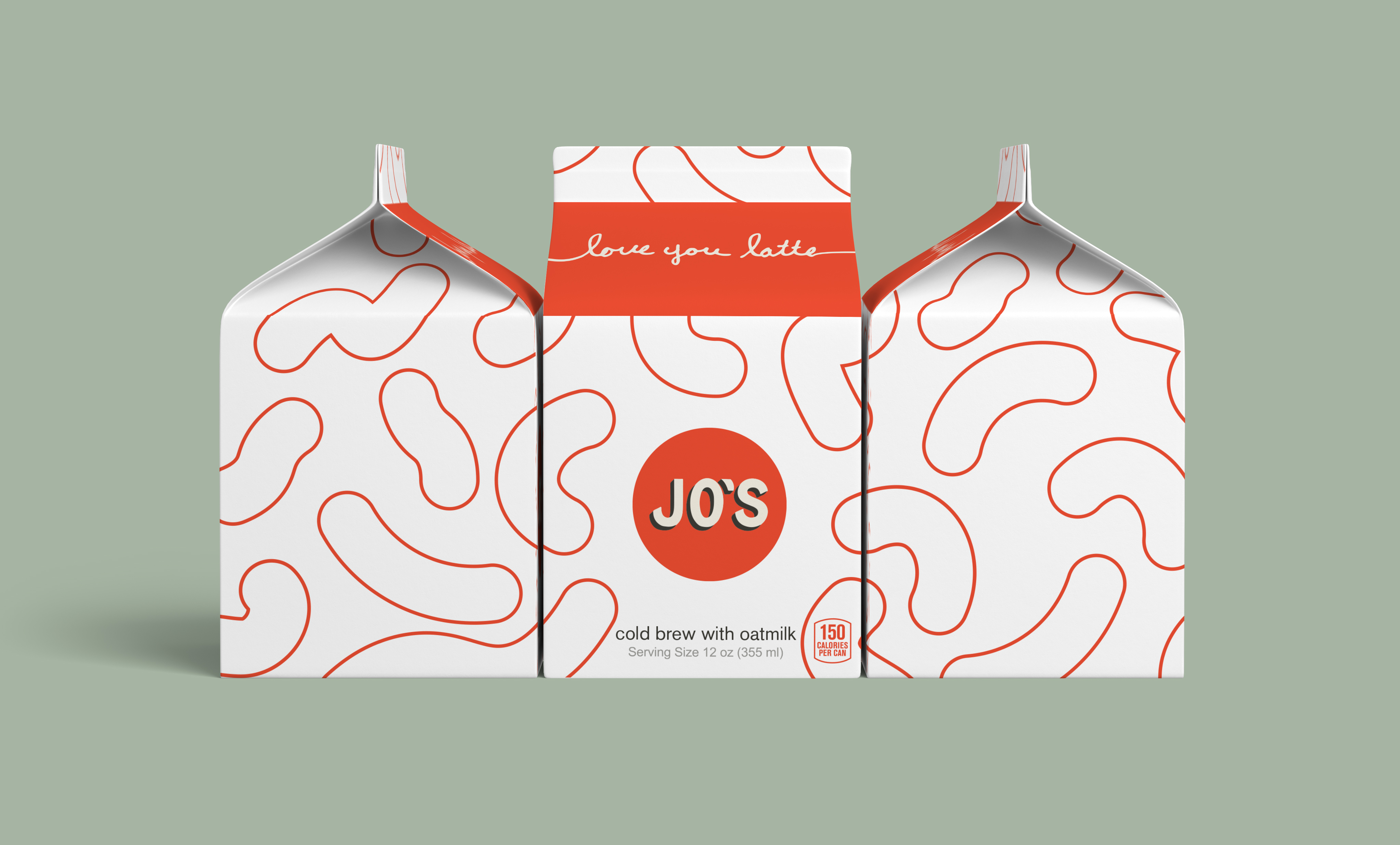
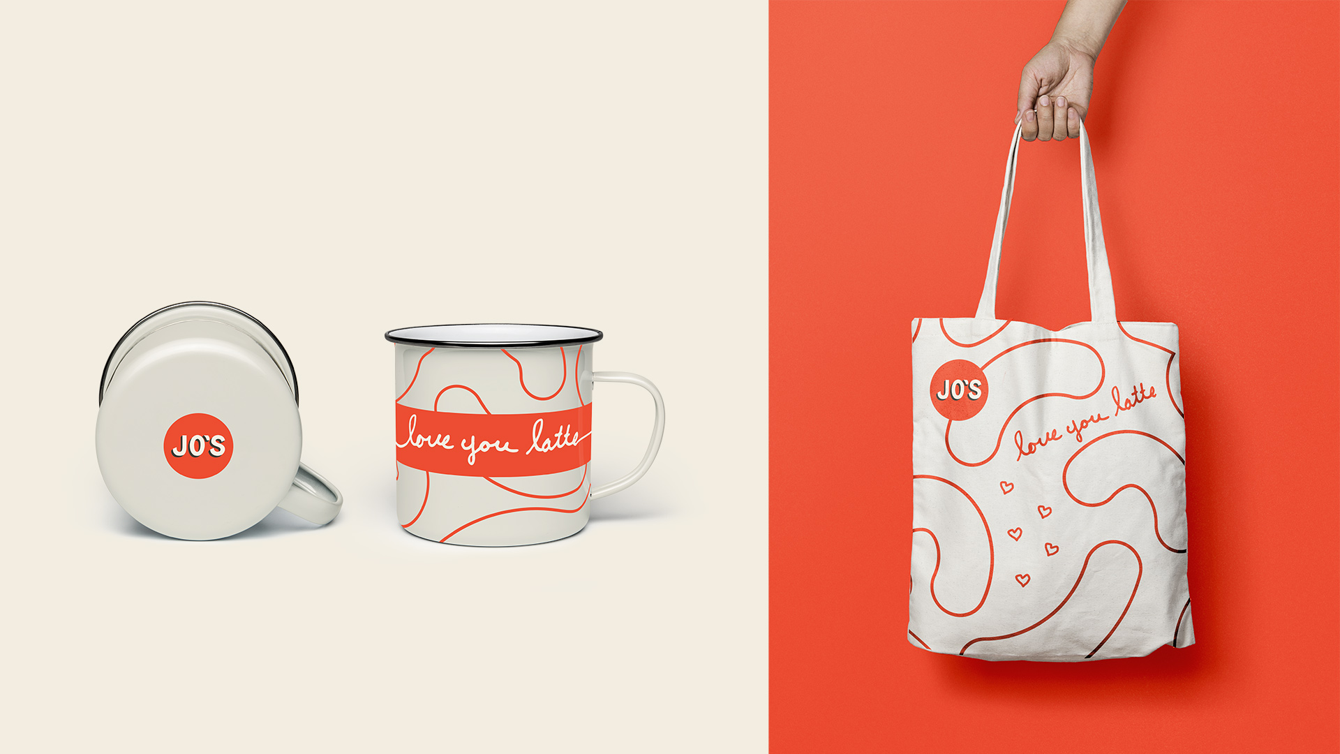
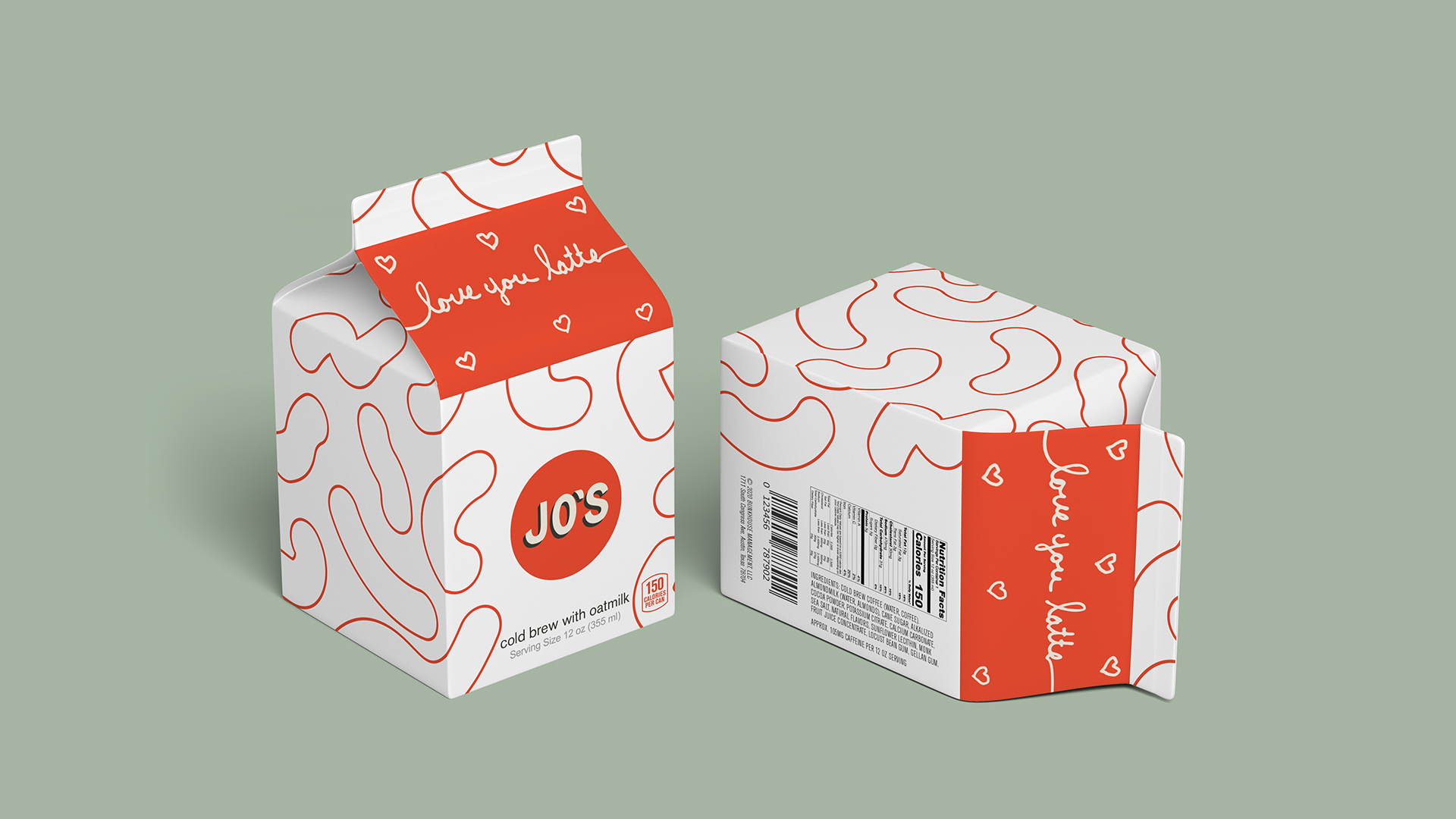
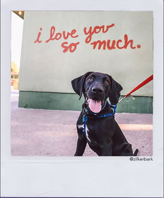
SolutionBy immersing myself in Jo’s brand history and current asset ecosystem, I familiarized myself with their visual language and expanded on it. Taking information from competitive analysis and several retail shelf audits, I developed “i love you latte” which played well with their sense of community, love of coffee, and their trademarked Instagramable graffiti wall.
Skills
Art Direction, Logo Design, Visual Design, Packaging Design, Brand Strategy & Research
Art Direction, Logo Design, Visual Design, Packaging Design, Brand Strategy & Research
Timeframe
4 weeks
4 weeks
Collaborators
None
None
Tools
Illustrator, Photoshp, After Effects, Miro
Illustrator, Photoshp, After Effects, Miro
Timeline
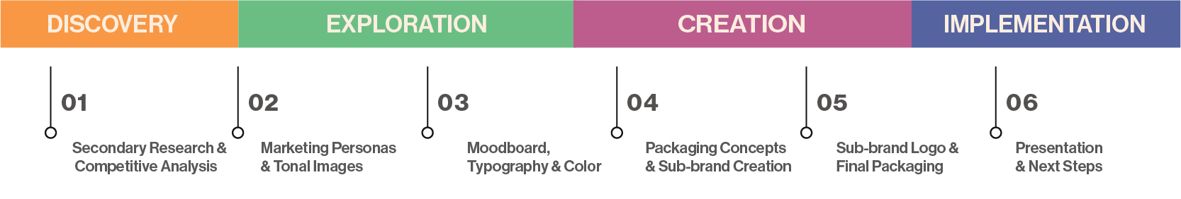

Discovery
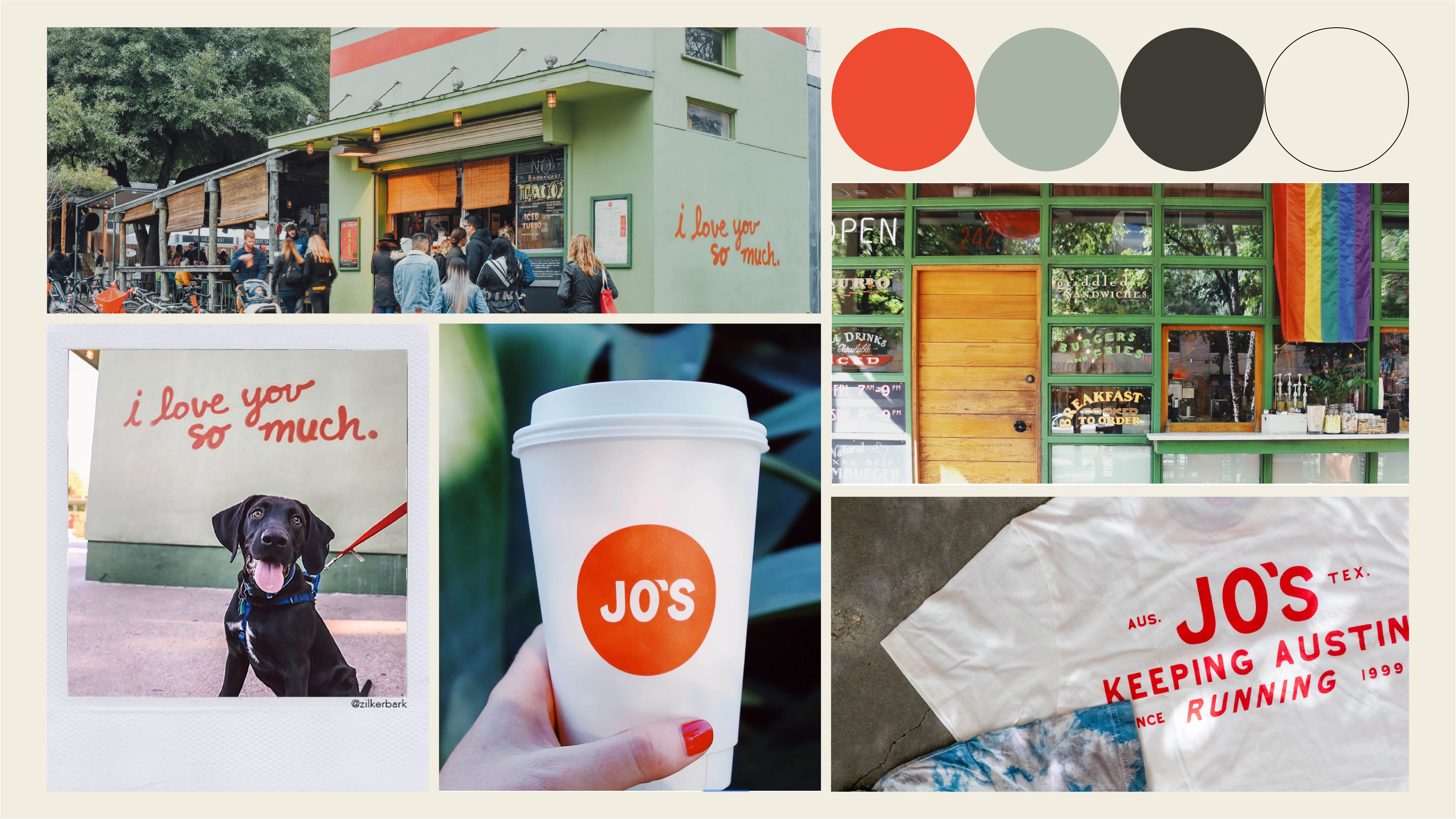
I started the discovery process by taking a look at the current brand ecosystem. I reviewed their current assets and audience. To develop marketing personas and create a brand board that I could visually reference during the design process. It was
tremendously
helpful to see visually who I was designing for. Because this product was destined to live on the shelf, it was important to do a competitive analysis, and audit of current retail offerings and how they look on the shelf.
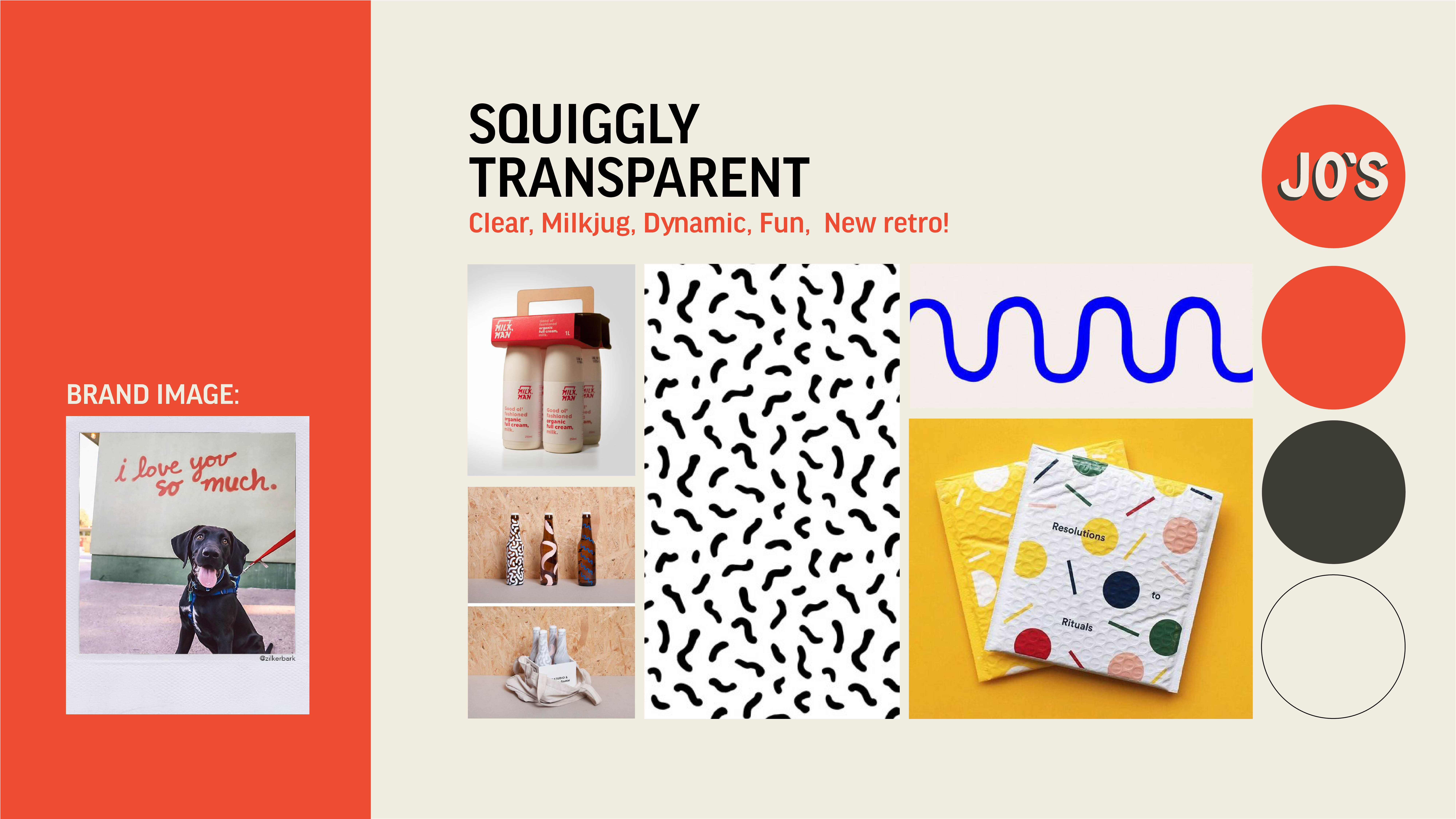
Brandboard
Moodboards

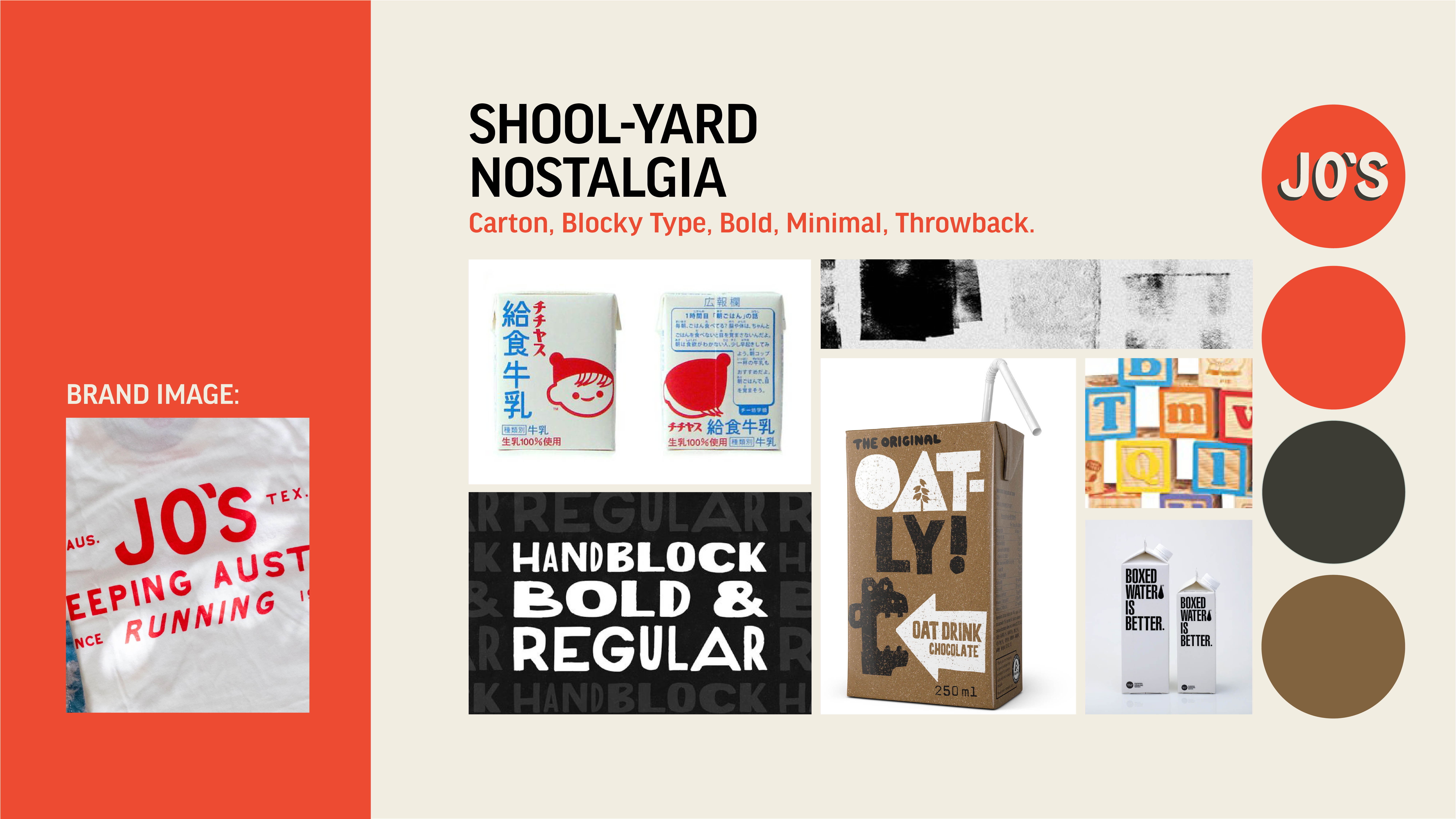
Exploration
I created three moodboards with separate directions based on images from the brand board. I ended up combing elements from “Schoolyard Nostalgia” and “Squiggly Transparent.”
While keeping the creative brief & brand one-pager on hand
I began
highlighting key phrases and using those as a jumping-off point for the mind mapping process, I felt a strong epiphany when I wrote the words “i love you latte” This would play very well with their trademarked instagrammable graffiti wall.
Generative
After pursuing the “love you latte” as a final direction, I then needed to figure out how to capture that graffiti script essence without buying spraypaint and finding a stucco wall, I decided on purple sharpie on cheap grainy sketching paper.
After a round of iteration,
I decided to switch to a milk carton for the final product. This was by far cheaper to produce, was a sustainable option, and also was a “dairy cue” that suggested to the user that they should expect a creamier beverage.
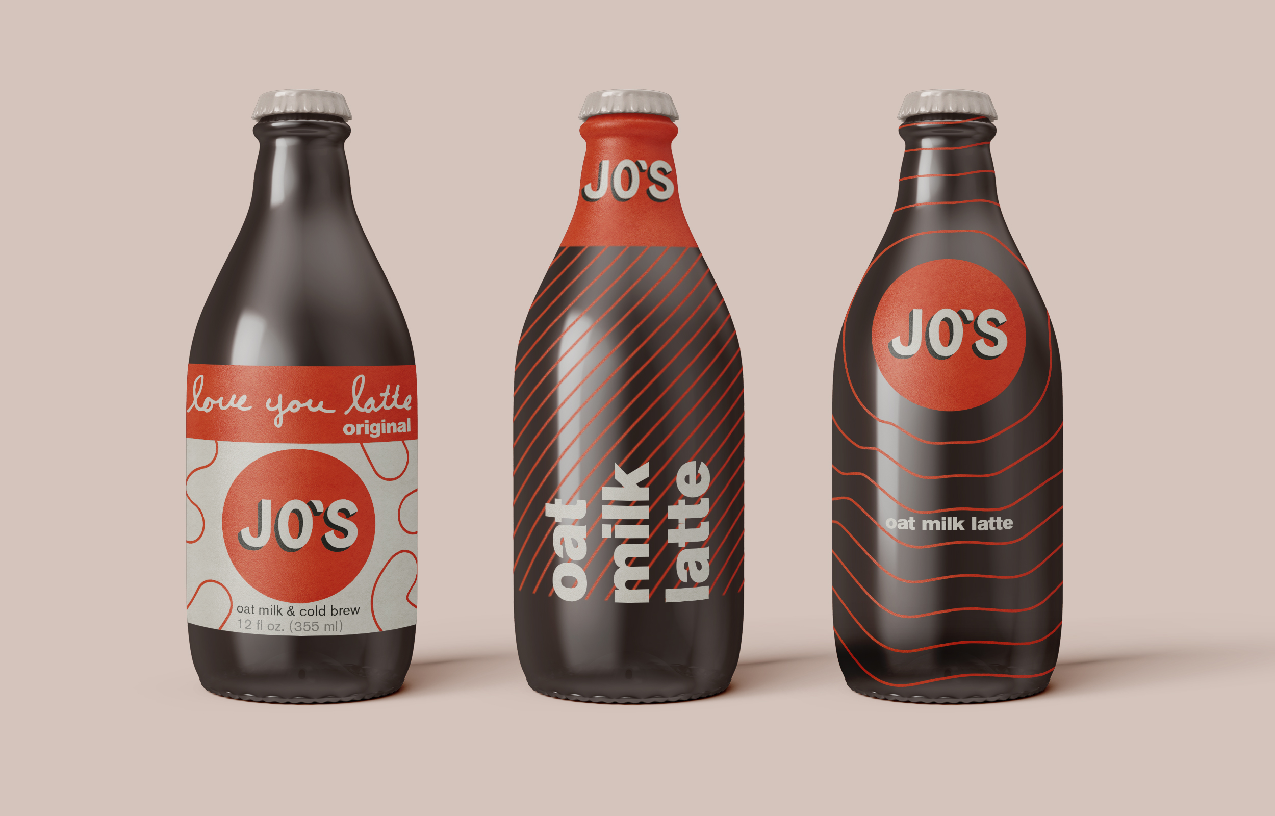
Iterations
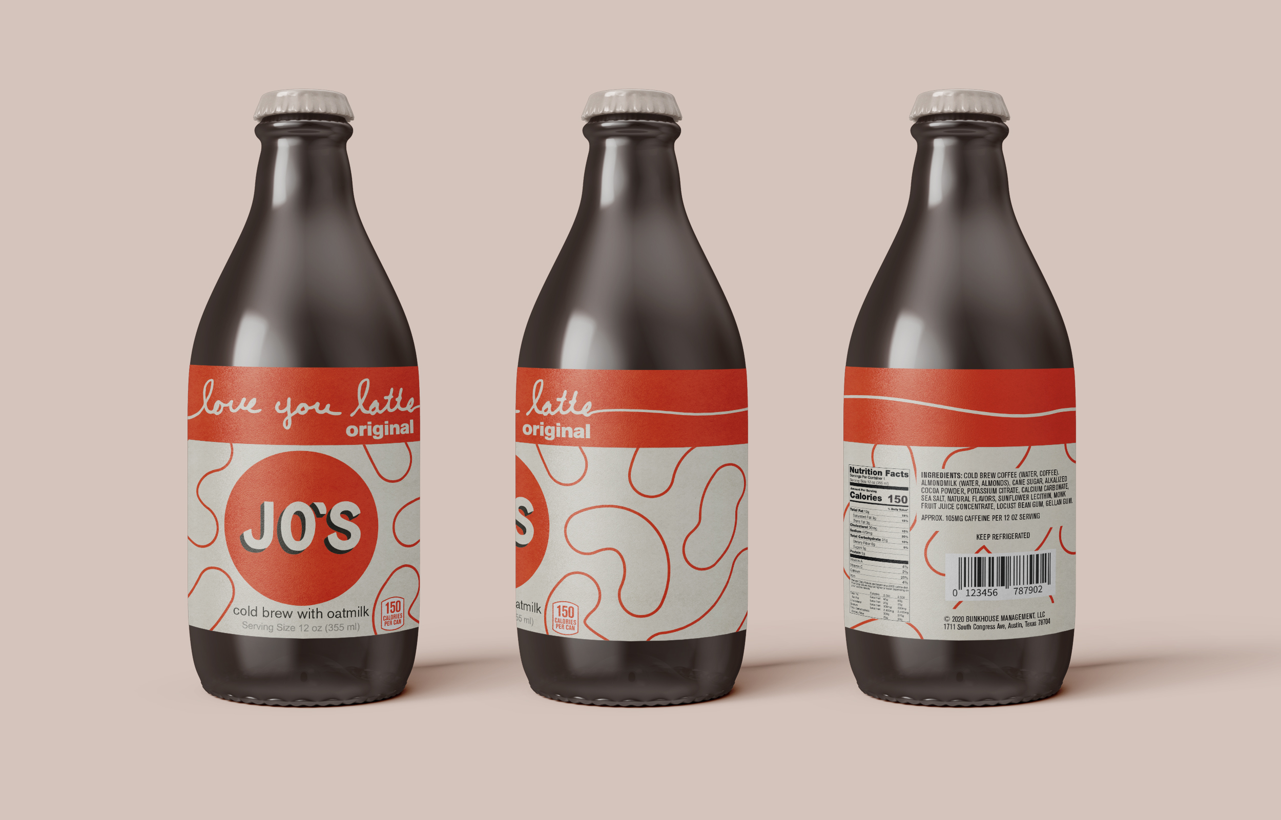
Final