


Juice // A Natural Wine Magazine
Problem
How might we use design to extend a friendly and inclusive invitation to become more well-informed about the rich world of natural wine?
Solution
By creating a welcoming and visually lush periodical that is easy to read, features stunning photography, and invites the reader in by introducing them to the real people who make natural wine. This personal approach connects the reader to the rich world of natural wine.
By creating a welcoming and visually lush periodical that is easy to read, features stunning photography, and invites the reader in by introducing them to the real people who make natural wine. This personal approach connects the reader to the rich world of natural wine.
Skills
Art Direction, Logo Design, Visual Design, Brand Strategy, Research, Print Layout & Copy
Art Direction, Logo Design, Visual Design, Brand Strategy, Research, Print Layout & Copy
Timeframe
12 weeks
12 weeks
Collaborators
None
None
Tools
Indesign, Figma, Photoshop, Illustrator & Miro
Indesign, Figma, Photoshop, Illustrator & Miro
Timeline

Discovery
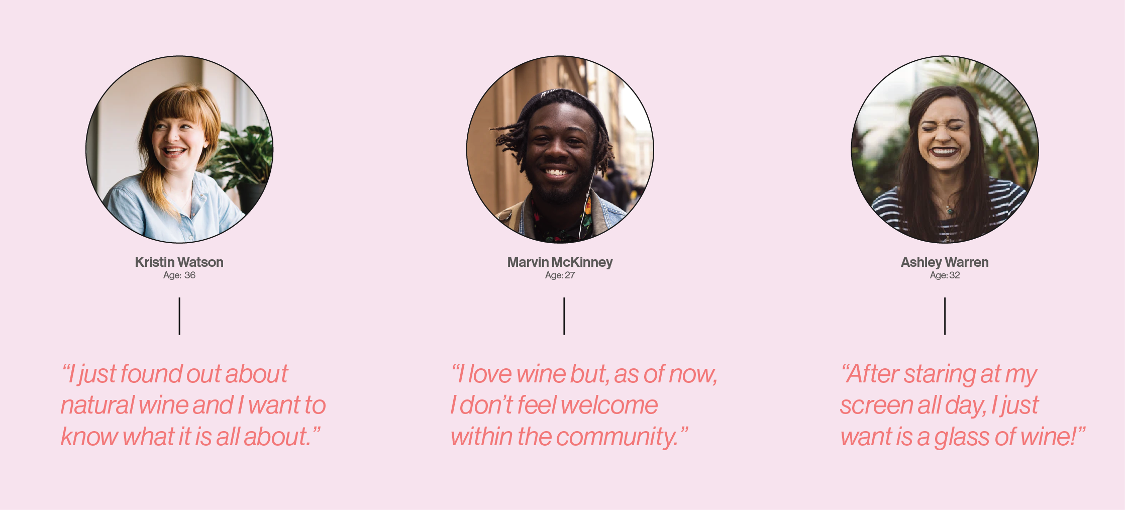
Research is an important step in any design work, so I started by reading countless articles on wine and conducting informational interviews with peers within the restaurant industry and those with a general interest in natural wine.
I then distilled the information into personas highlighting their specific pain points. The main takeaway was that many people perceived the wine industry as pretentious and felt intimidated by the process of choosing a bottle of wine.
Moodboards

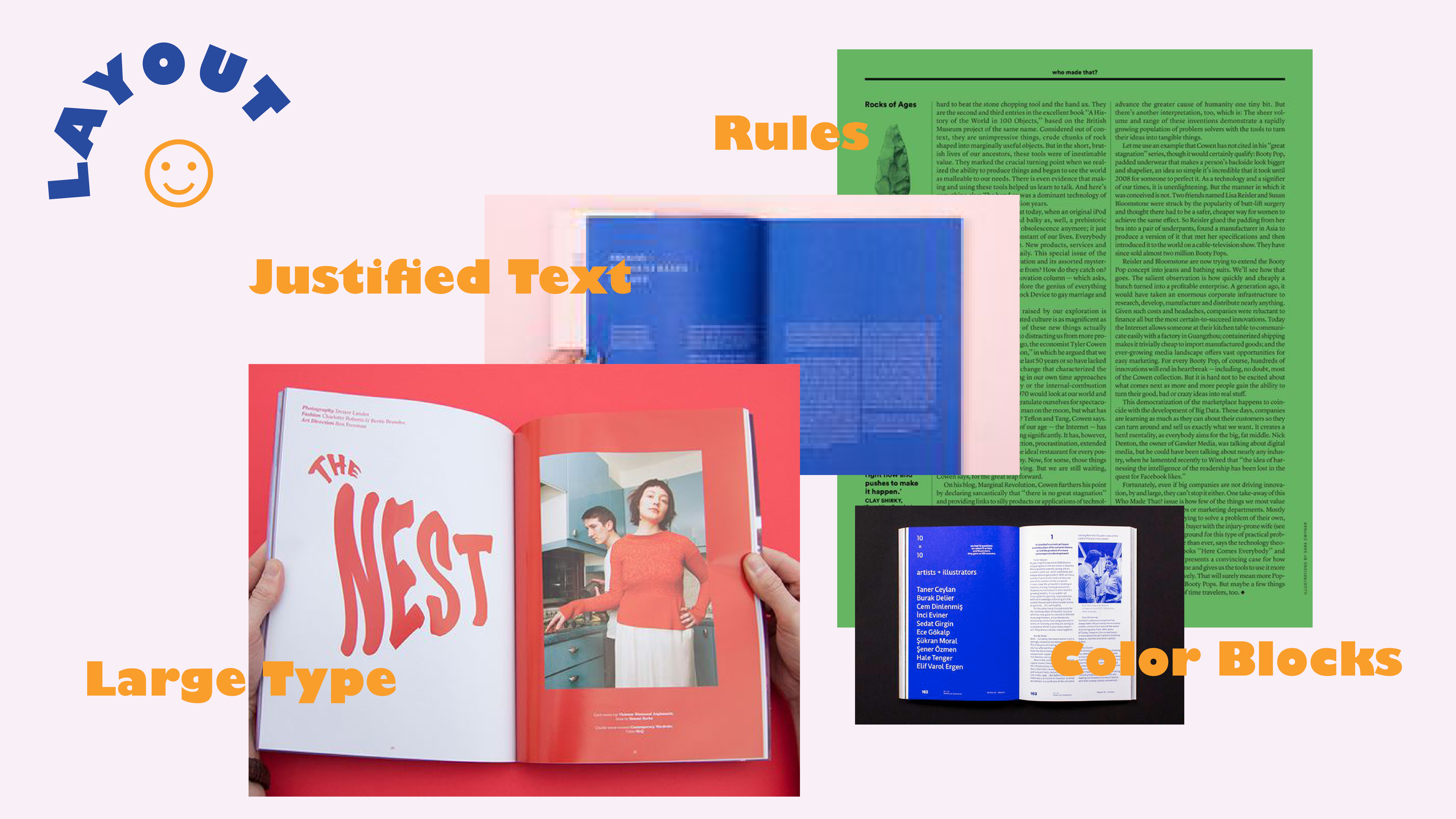
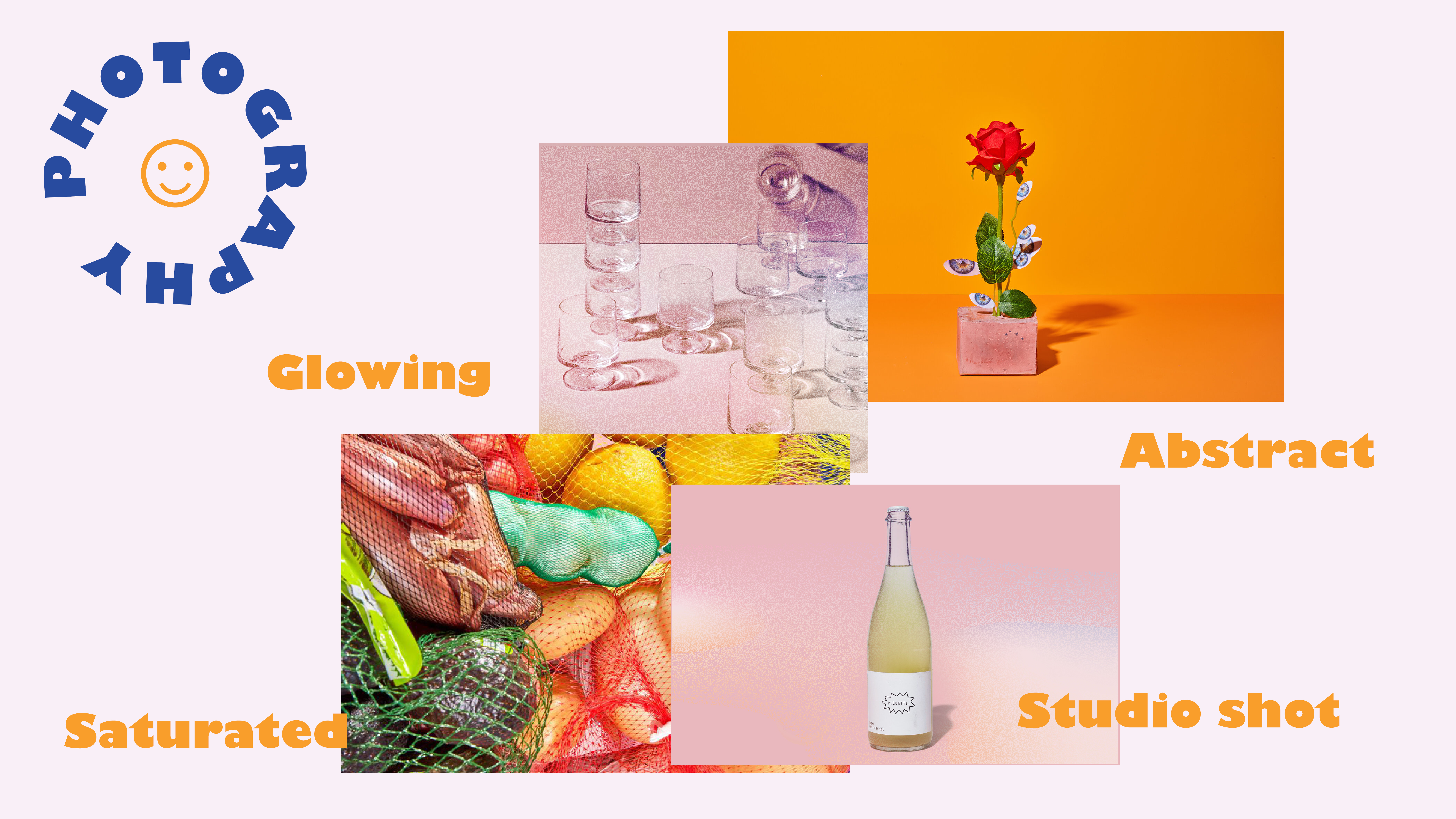
Exploration
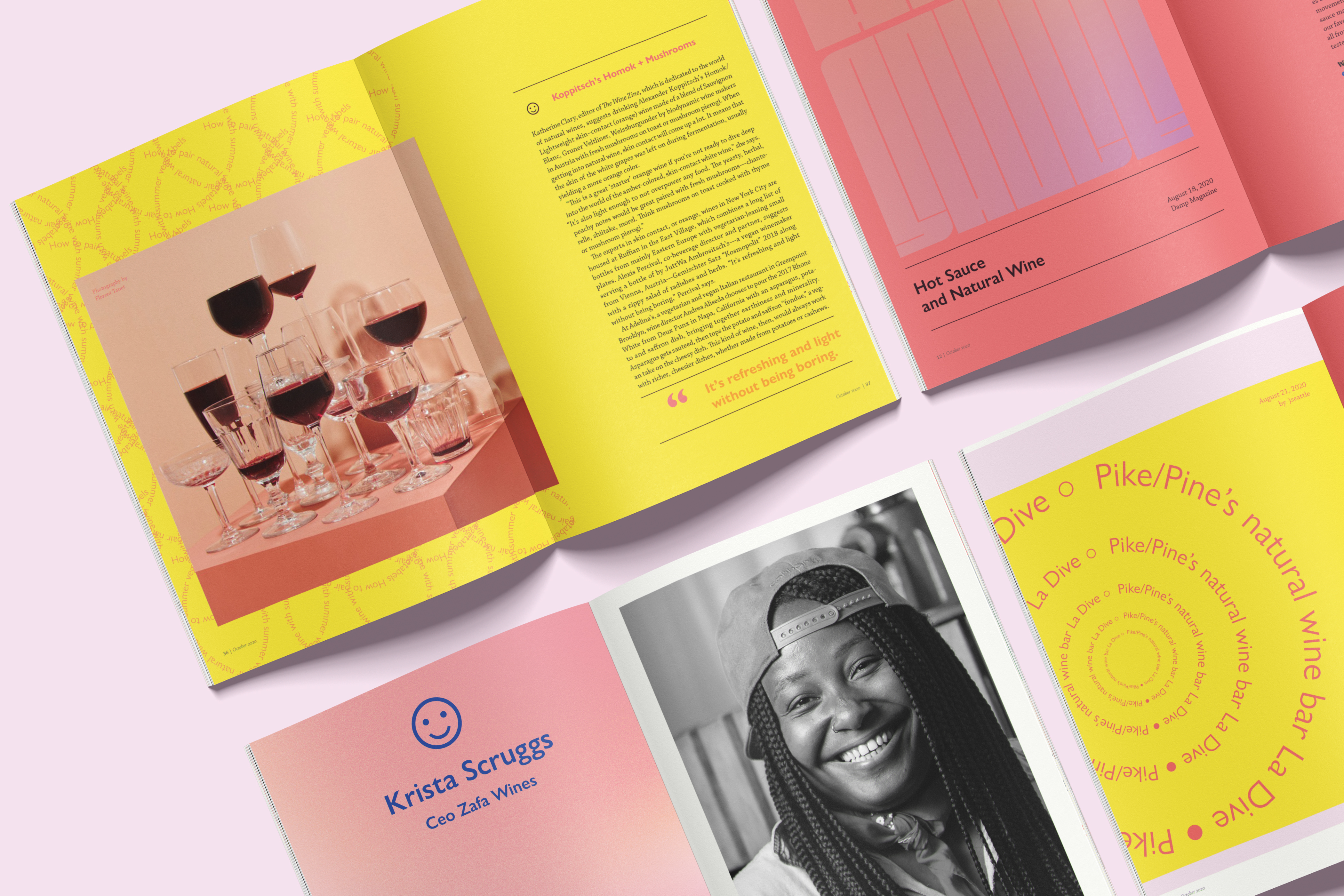
With my research in mind, I began to curate images and colors into several moodboards focusing on graphic elements, layouts, and photography style. For typography, I decided on Gill Sans Ultrabold for its quirky and playful forms.
I then vetted Chapparal Pro Regular for the body copy, by printing test pages at various sizes, line heights, and line lengths. Then I set up the modular and baseline grids based on the most visually appealing length.
Generative
A magazine is a design system; in any system, the parts have their own identity because they have a function to perform, but they also need to work together as
units within the whole system. Keeping this in mind, I began to develop different “article recipes” with paragraph and character styles that I could apply as needed.
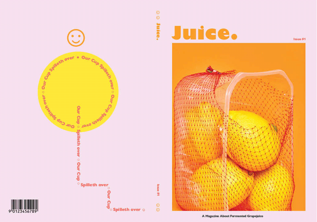
It was important to create styles that were unique but still felt cohesive within that magazine. After the recipes were completed, I began to work on the logo, masthead, cover page, table of contents, and letter from the editor. I then laid out all the content and photography.
Pages
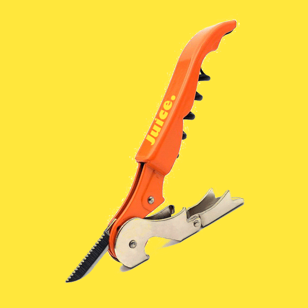
Accessories

Implementation
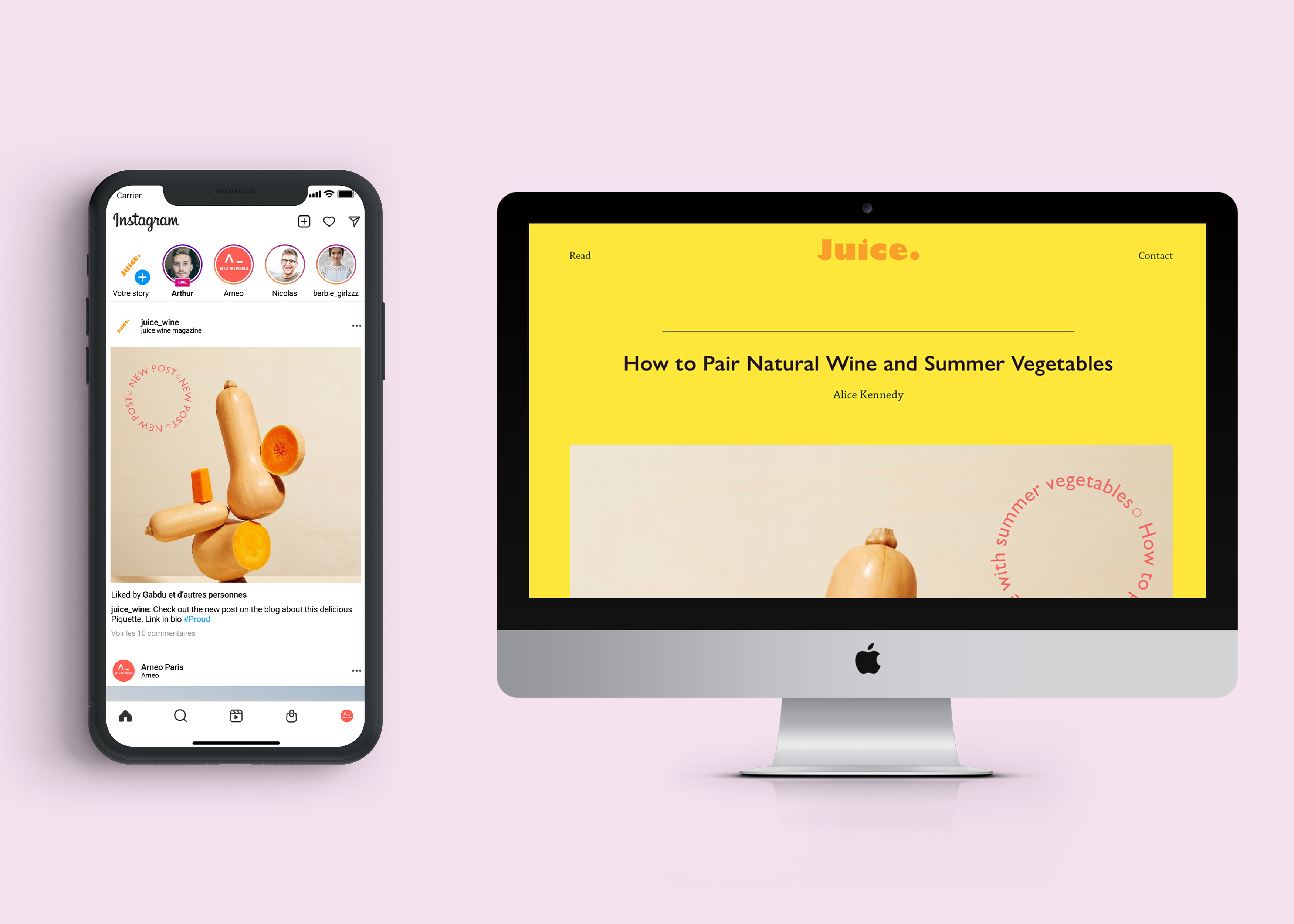
Considering the drastic changes brought to our society by covid-19 and the diminishing resources on this planet, I felt it was important to consider how the brand was expressed across digital mediums.
Considering the drastic changes brought to our society by covid-19 and the diminishing resources on this planet, I felt it was important to consider how the brand was expressed across digital mediums.
I took a deeper dive into social media strategy and posting structures. I then mapped out the user flow between the Instagram post and the web-based article.
Instagram Template & Blog