


Pilchuck Glass School // Re-brand
Problem
Pilchuck Glass School is a world-renowned institution for the glass arts—their reputation is unmatched however their current brand ecosystem has become splintered over the years and is disjointed between their very unique spaces and no is no longer reflective of who they are. There is also a concern about the next generation of glass artists.
Solution
Create a brand concept that is as multifaceted as Pilchuck and aligns with its mission and goal while considering its target demographic and current audience. Then express the concept as a cohesive visual system that is truly authentic to Pilchuck.
Create a brand concept that is as multifaceted as Pilchuck and aligns with its mission and goal while considering its target demographic and current audience. Then express the concept as a cohesive visual system that is truly authentic to Pilchuck.
Skills
Art Direction, Logo Design, Visual Design, Motion, Brand Strategy & Research
Art Direction, Logo Design, Visual Design, Motion, Brand Strategy & Research
Timeframe
12 weeks
12 weeks
Collaborators
Nicole Bucaro
Nicole Bucaro
Tools
Indesign, Figma, Photoshop, After Effects, Illustrator & Miro
Indesign, Figma, Photoshop, After Effects, Illustrator & Miro
Timeline
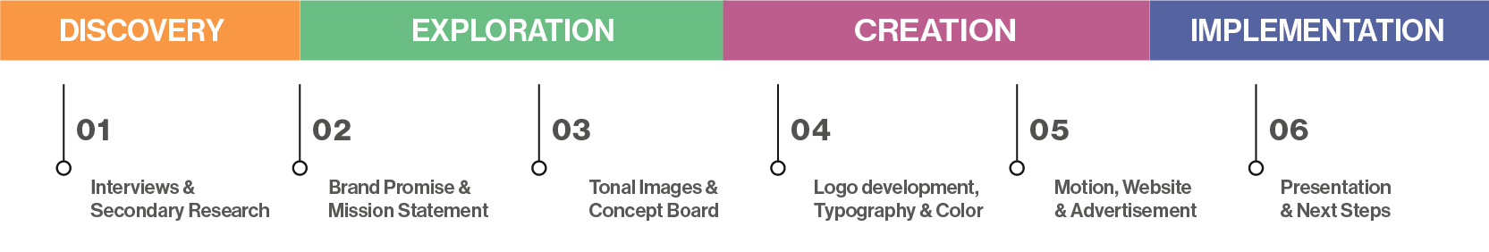
Discovery
By doing an in-depth evaluation of this multifaceted brand, we were able to develop
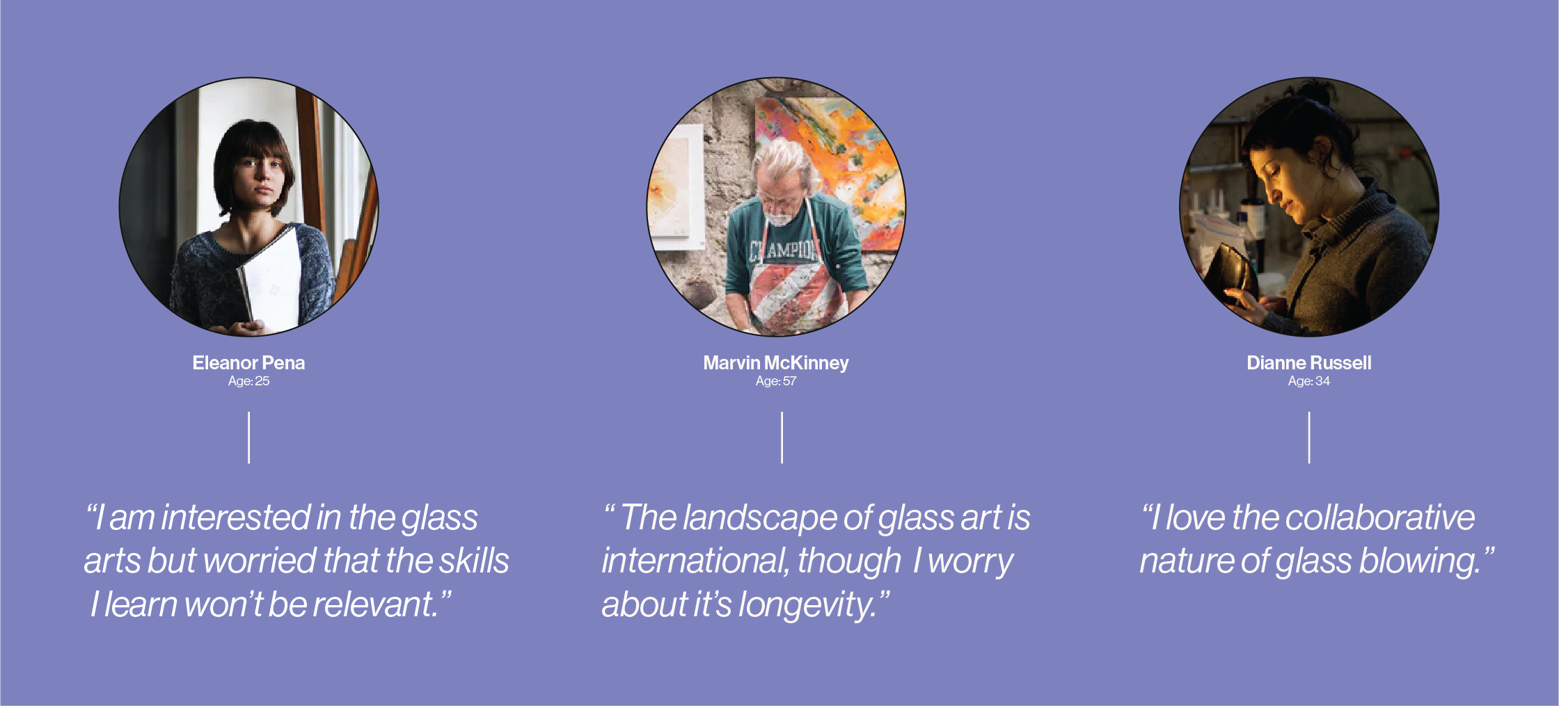
a brand identity that is reflective of who they are. We did an in-depth analysis of the landscape of the glass arts, conducted interviews with stakeholders,
and did a
competitive swot analysis of other schools in the industry. look at Narrowing in on aspects of their existing traits and cherry-picking ones that would be visually appealing to their target demographic.
“Many prominent glass art collectors are aging and arranging to leave their collections to museums. There is concern from galleries that there are not enough younger collectors to buy the works of today’s up-and-coming glass artists.”
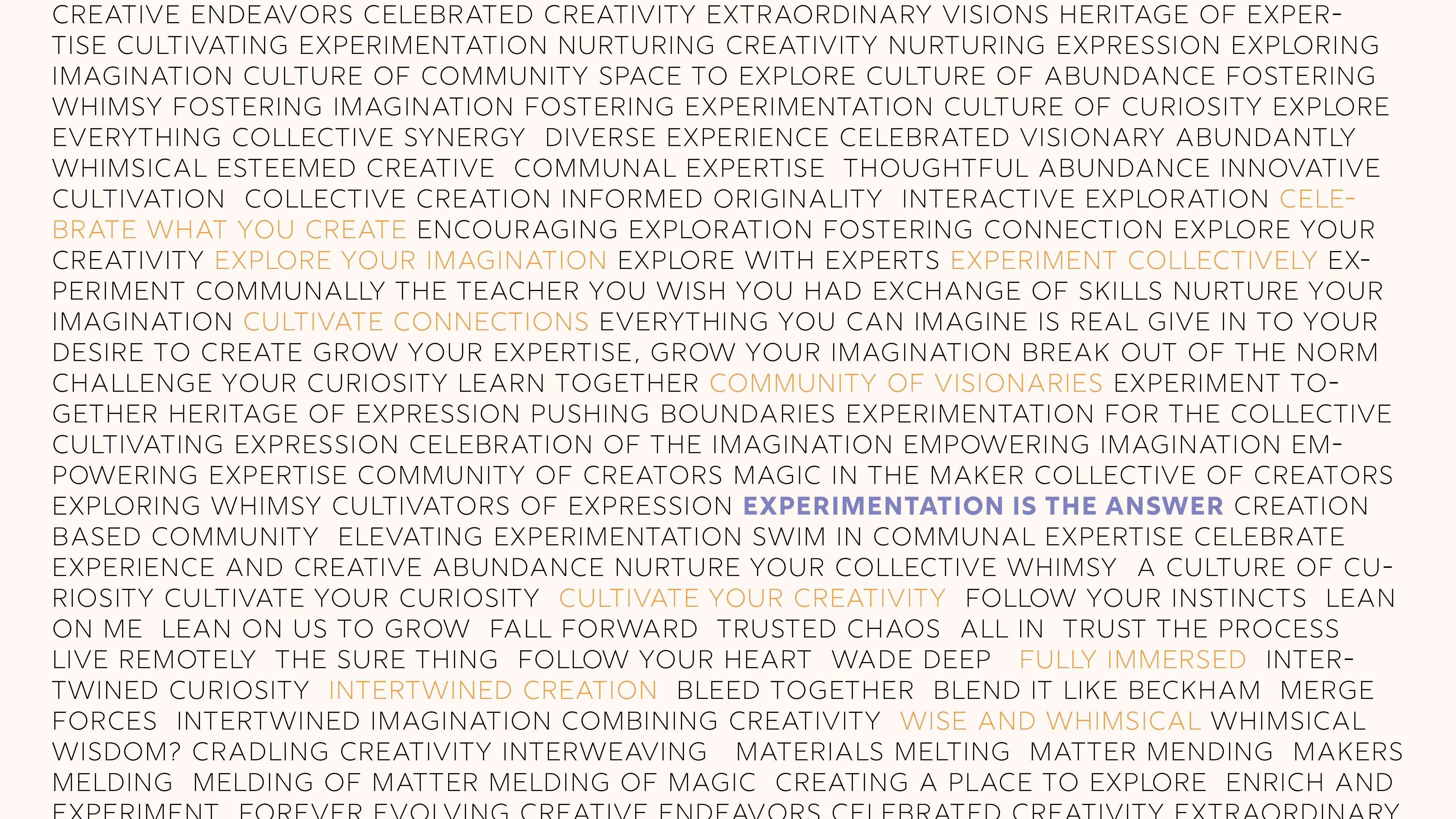
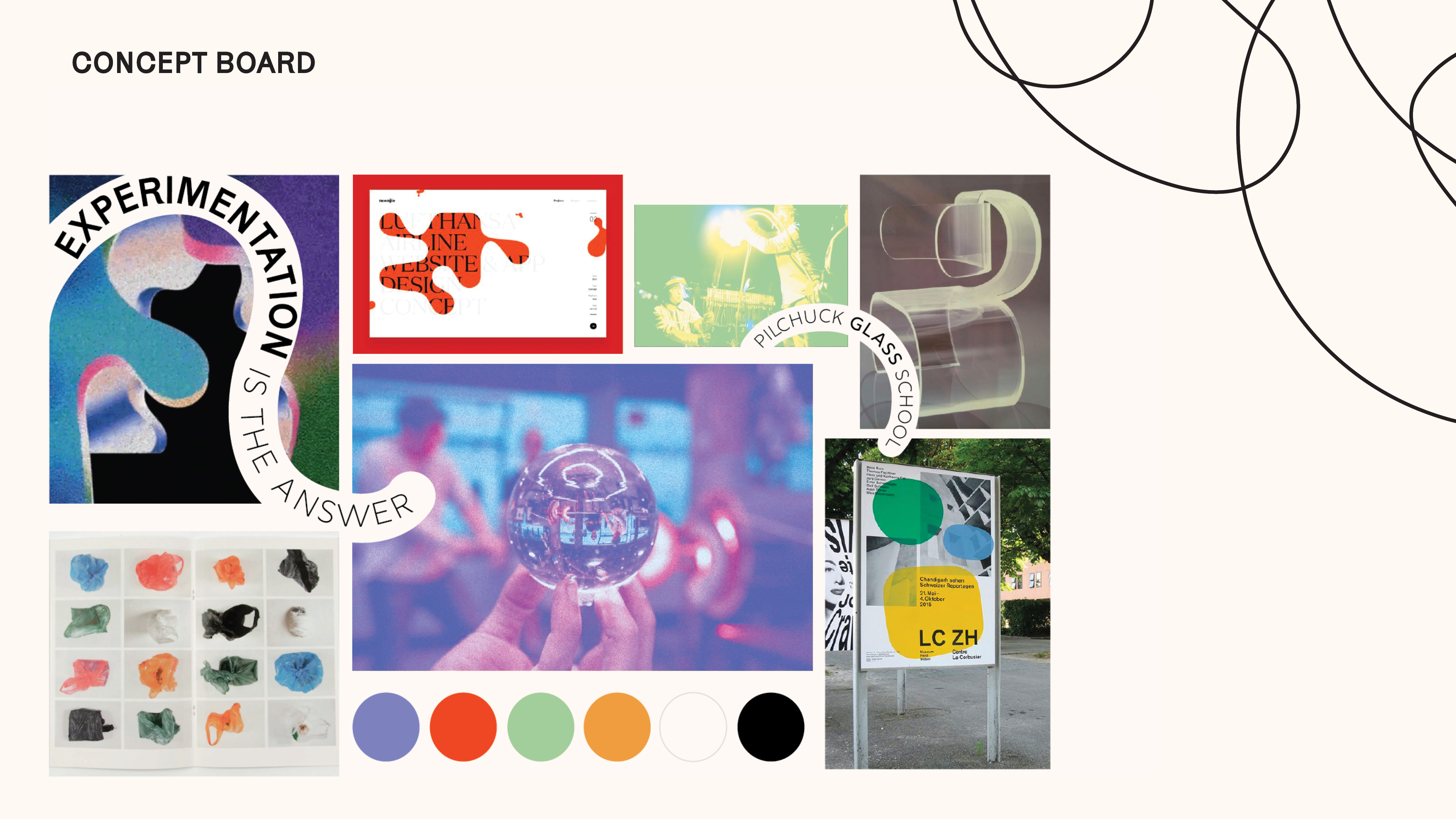
Tonal Territories
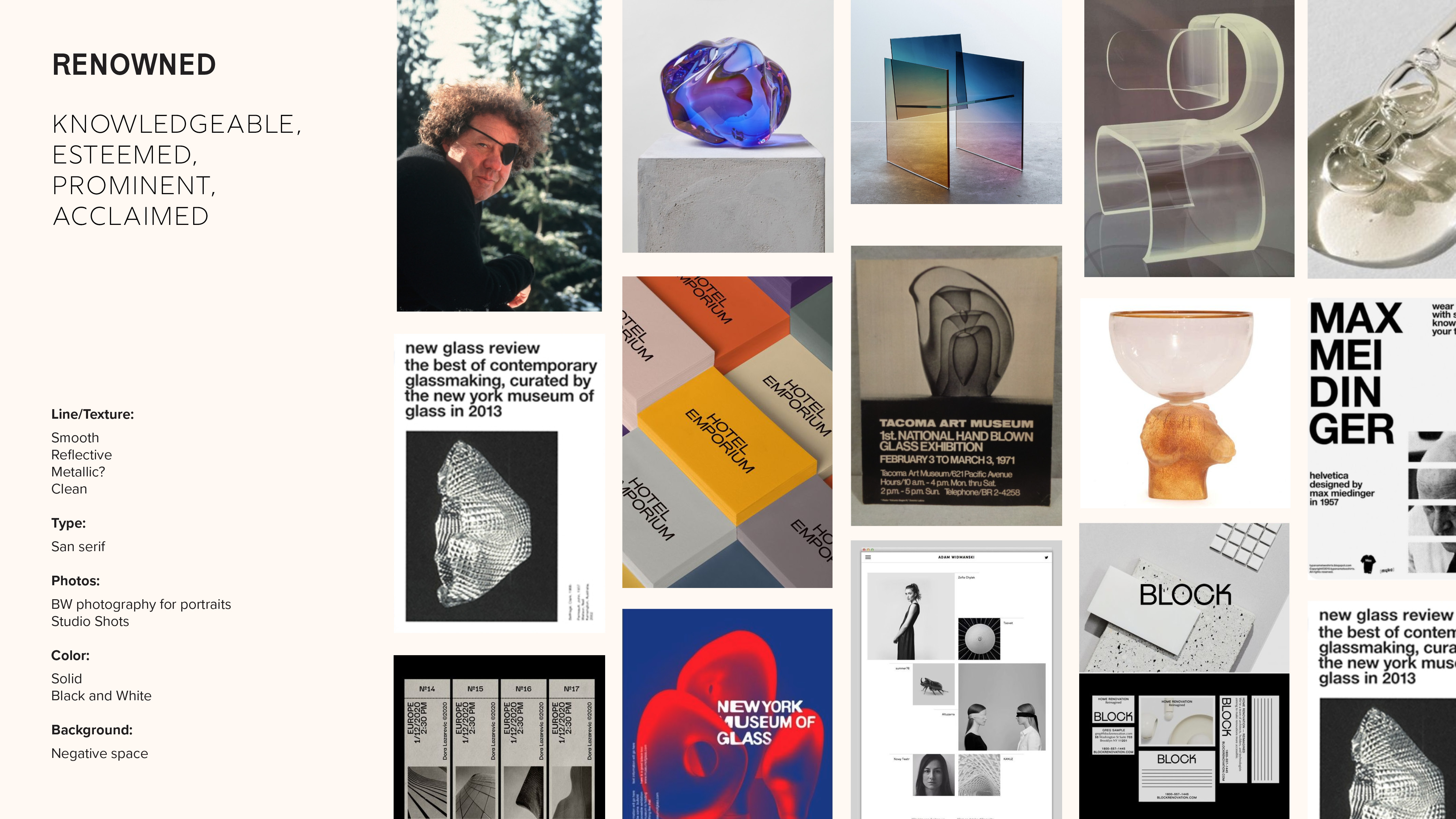
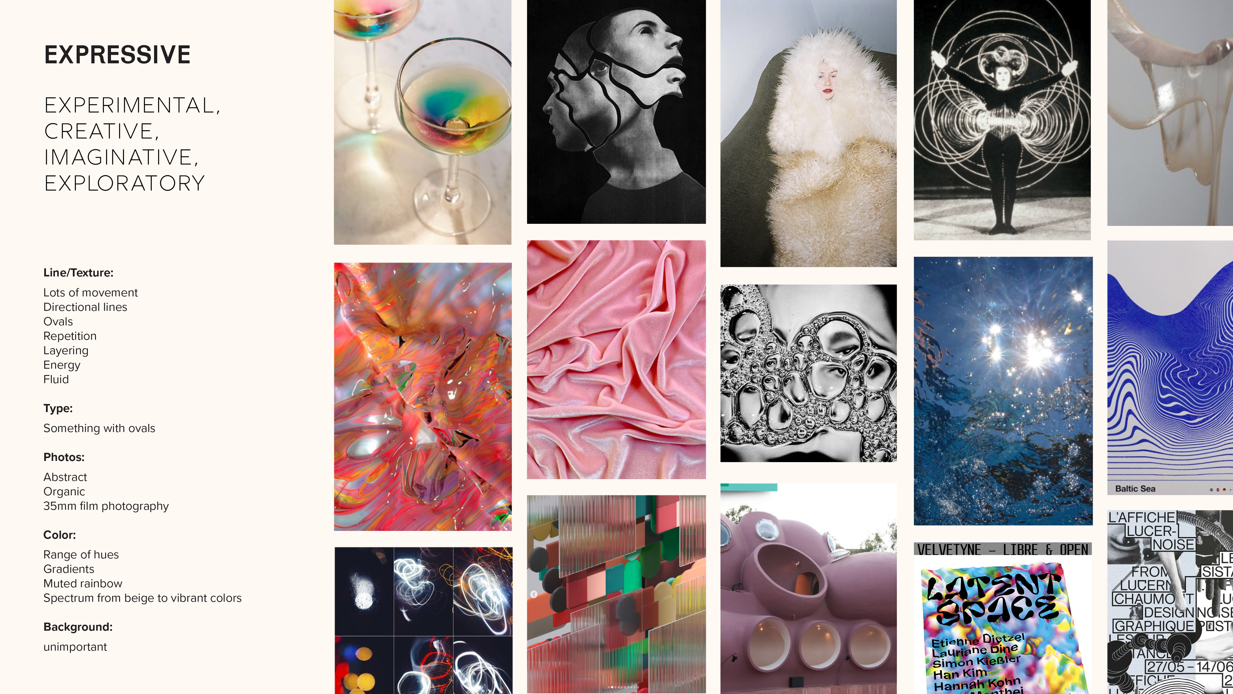
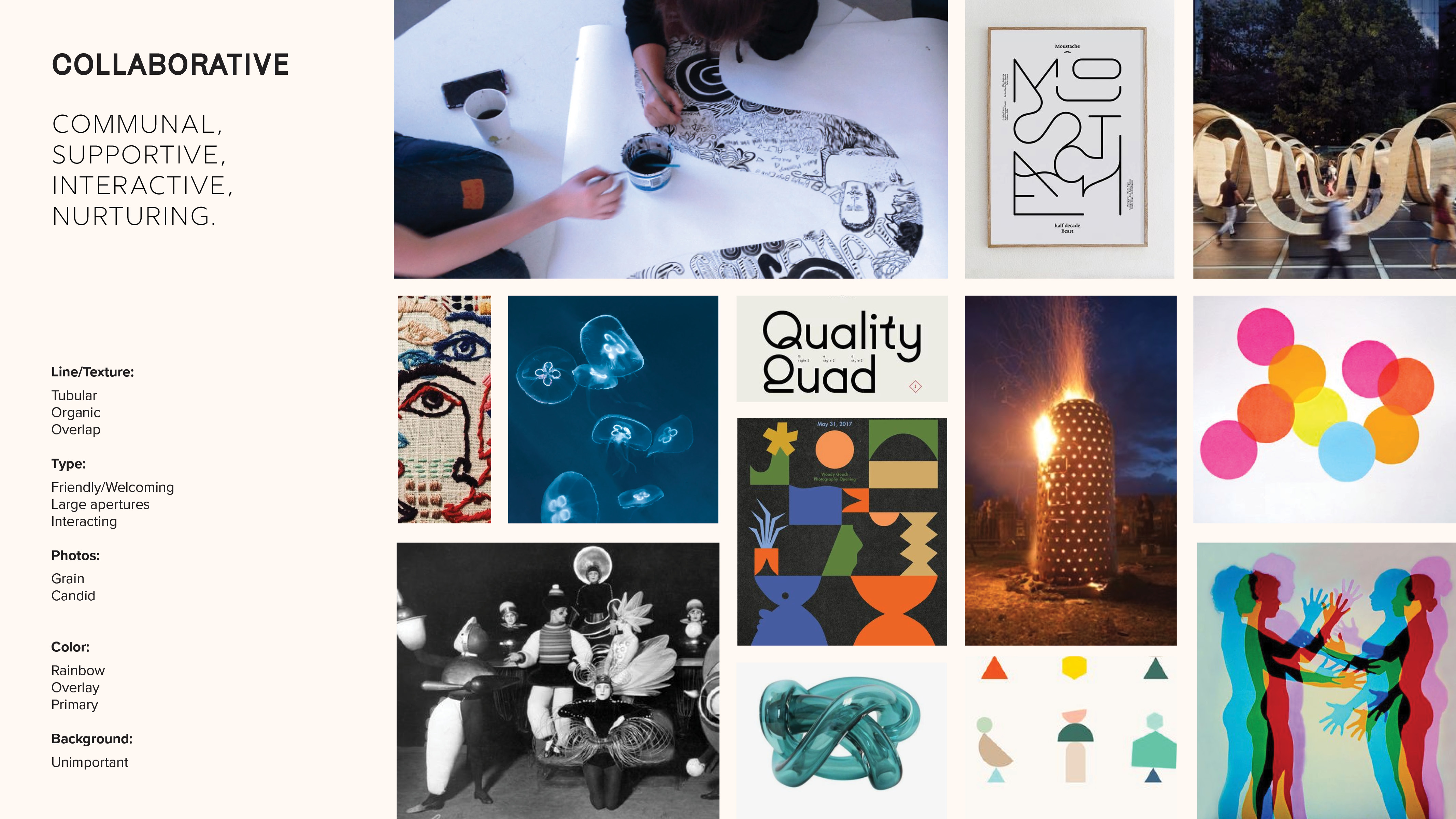
Exploration
After learning more about the brand, we generated adjectives, and images that reflected who Pilchuck was. We then used these adjectives to develop tonal territories that were then further refined
After learning more about the brand, we generated adjectives, and images that reflected who Pilchuck was. We then used these adjectives to develop tonal territories that were then further refined
into our final concept “EXPERIMENTATION IS THE ANSWER.” This would become our final source of truth, and we would vet all designs against this imageboard.
Concept Generation
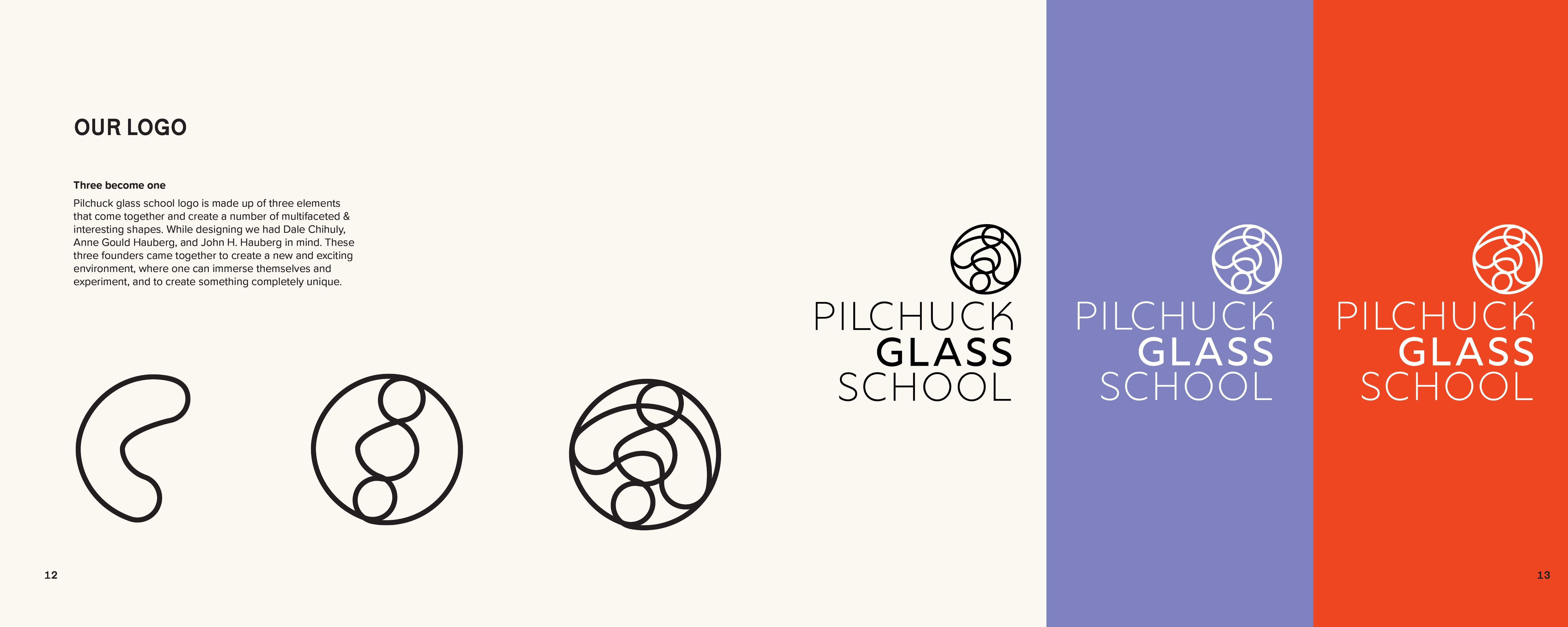
Creation Now that we had decided on a visual direction we then had to develop the logo. In order to be inspired for the logo mark, I looked deeply at the history of the company, had our brief in front of me, and began highlighting keywords. I used these words as inspiration for my pages of thumbnail sketches.
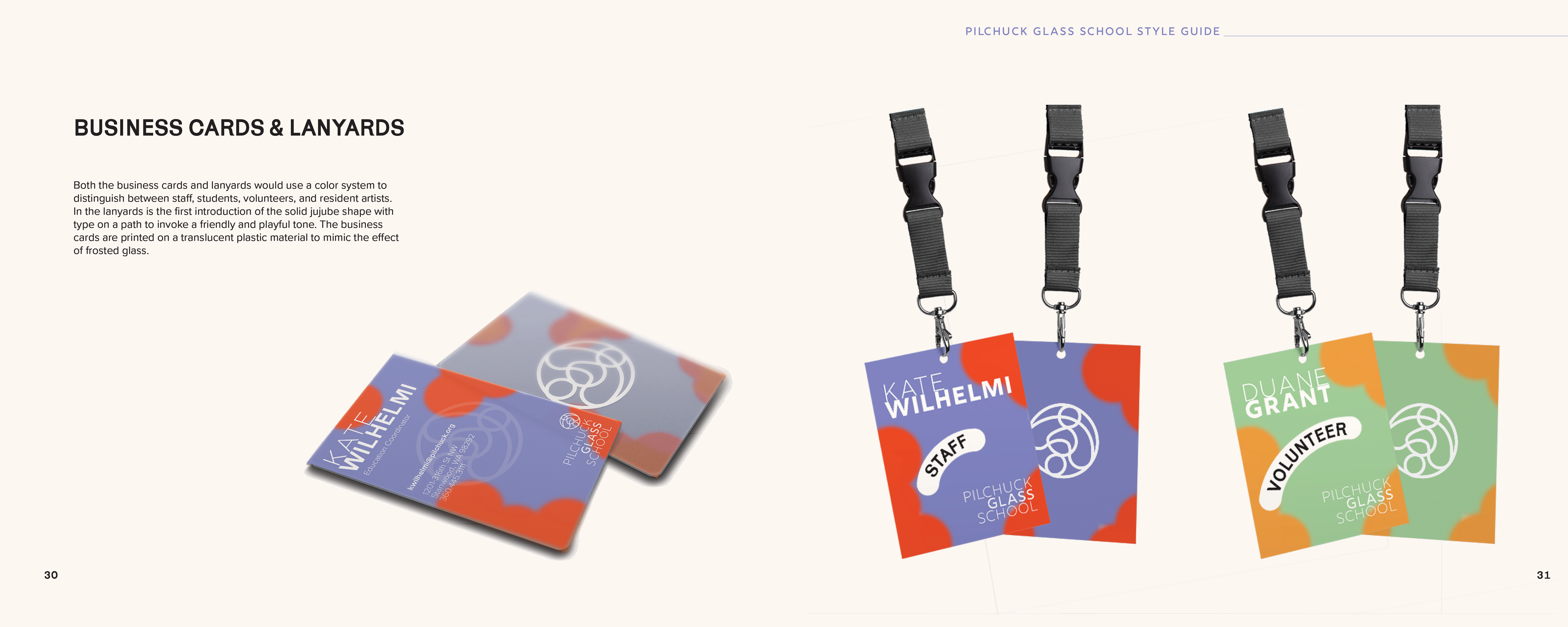
After developing the logo we began to experiment, we started on assets that were simple then slowly began to build things that were more complex. It was important to develop a piece that was the backbone of our brand. Once the visual language became more defined we started creating in-depth brand guidelines.
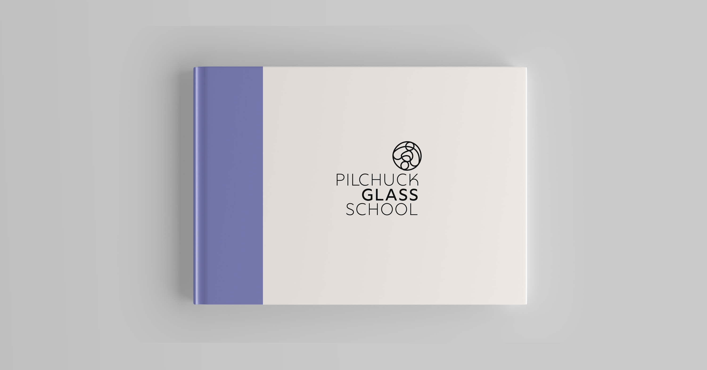
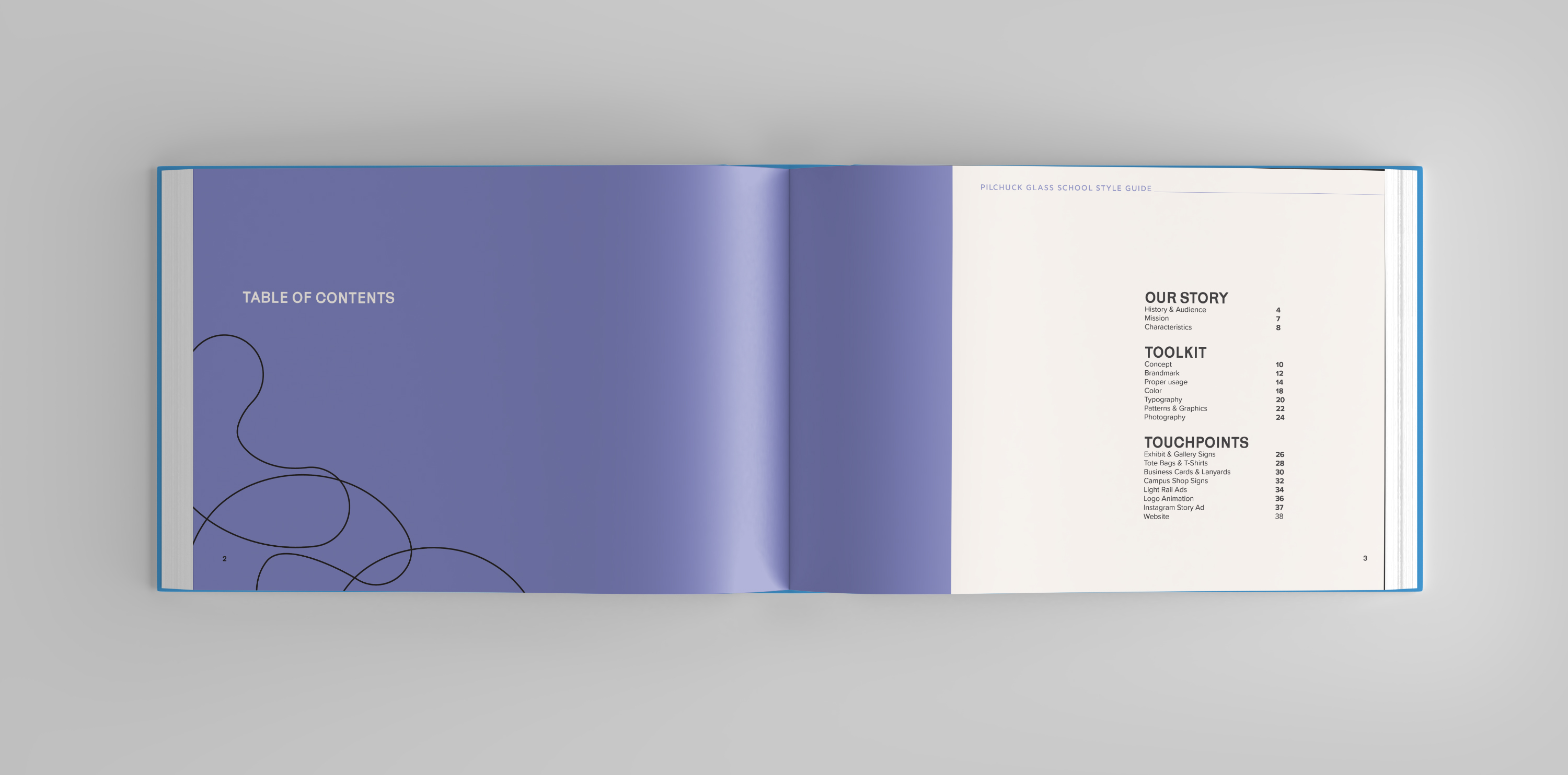
Brand Guidebook
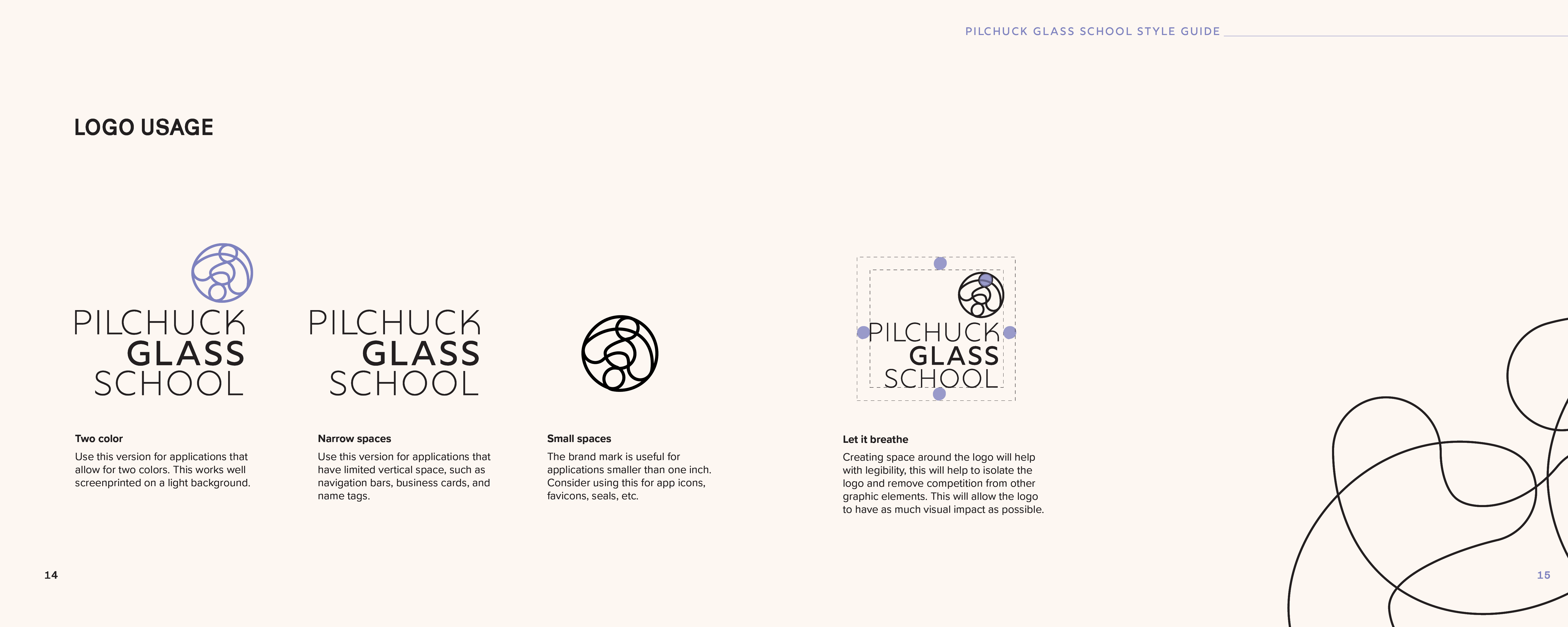
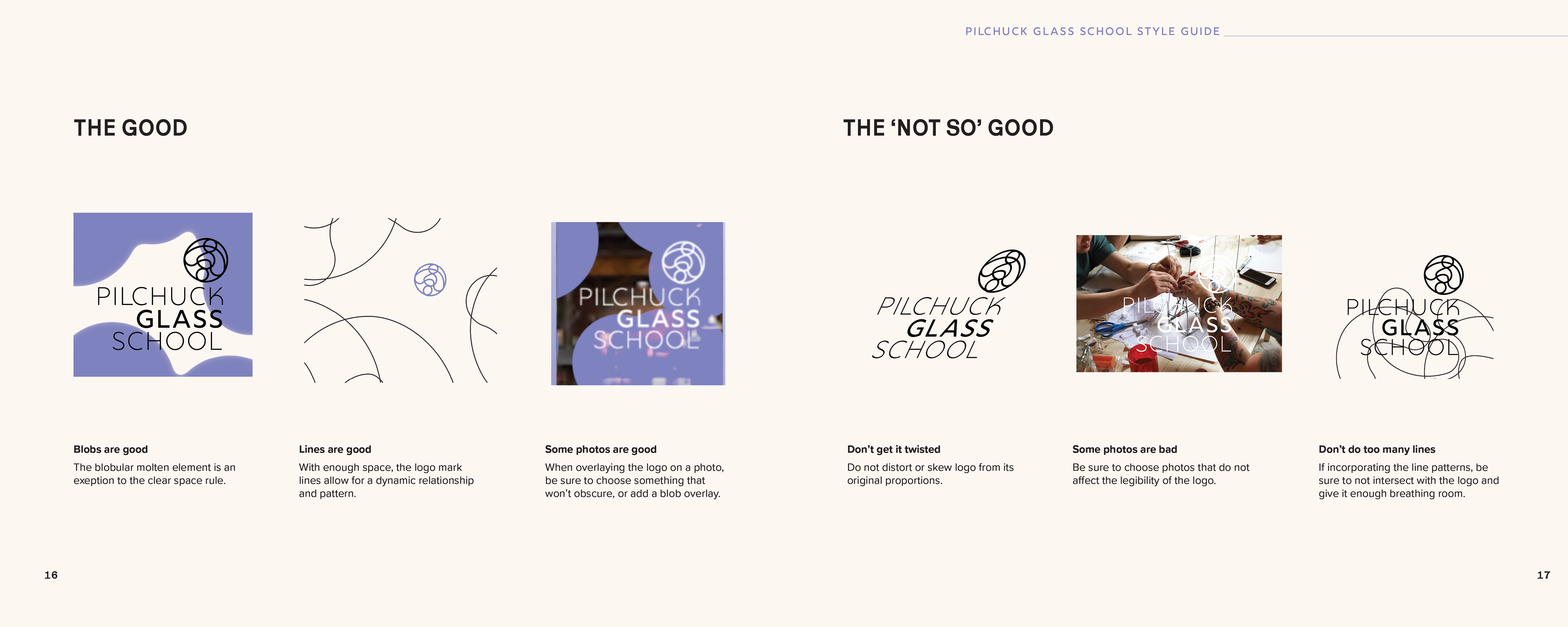
Logo Guidelines
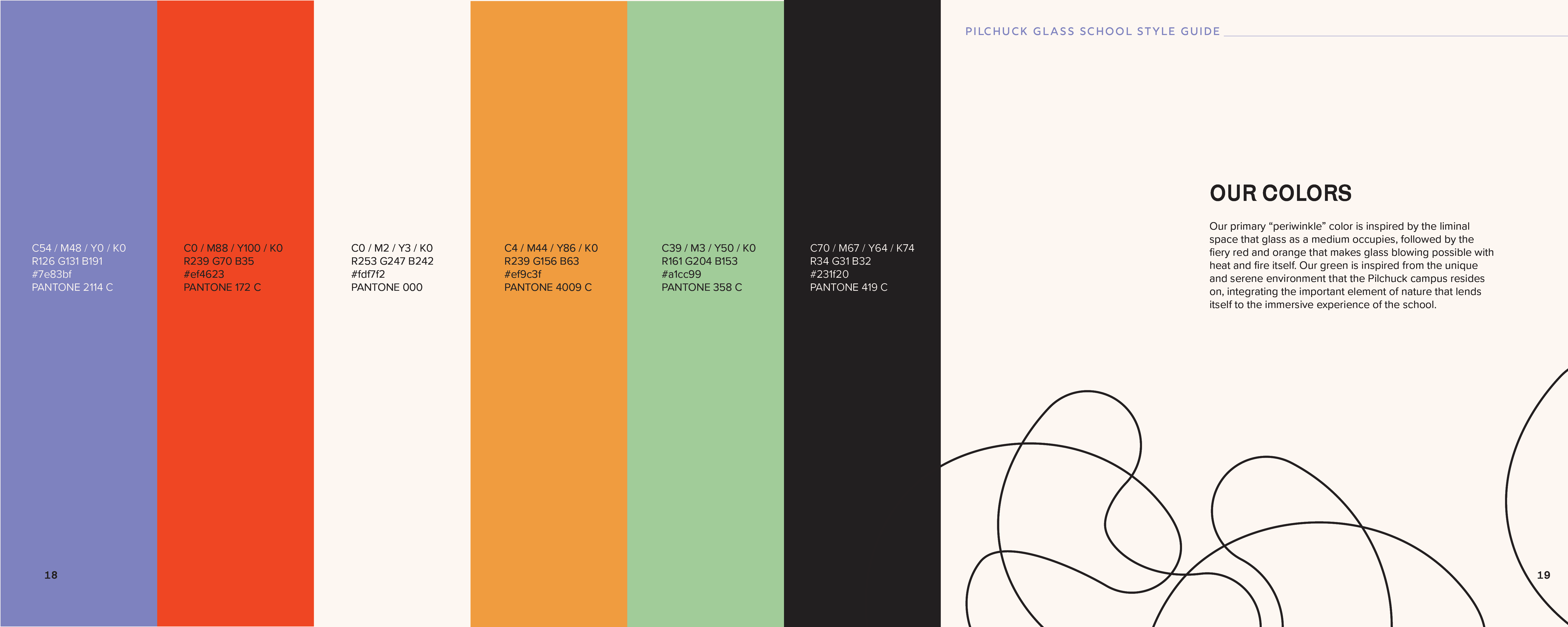
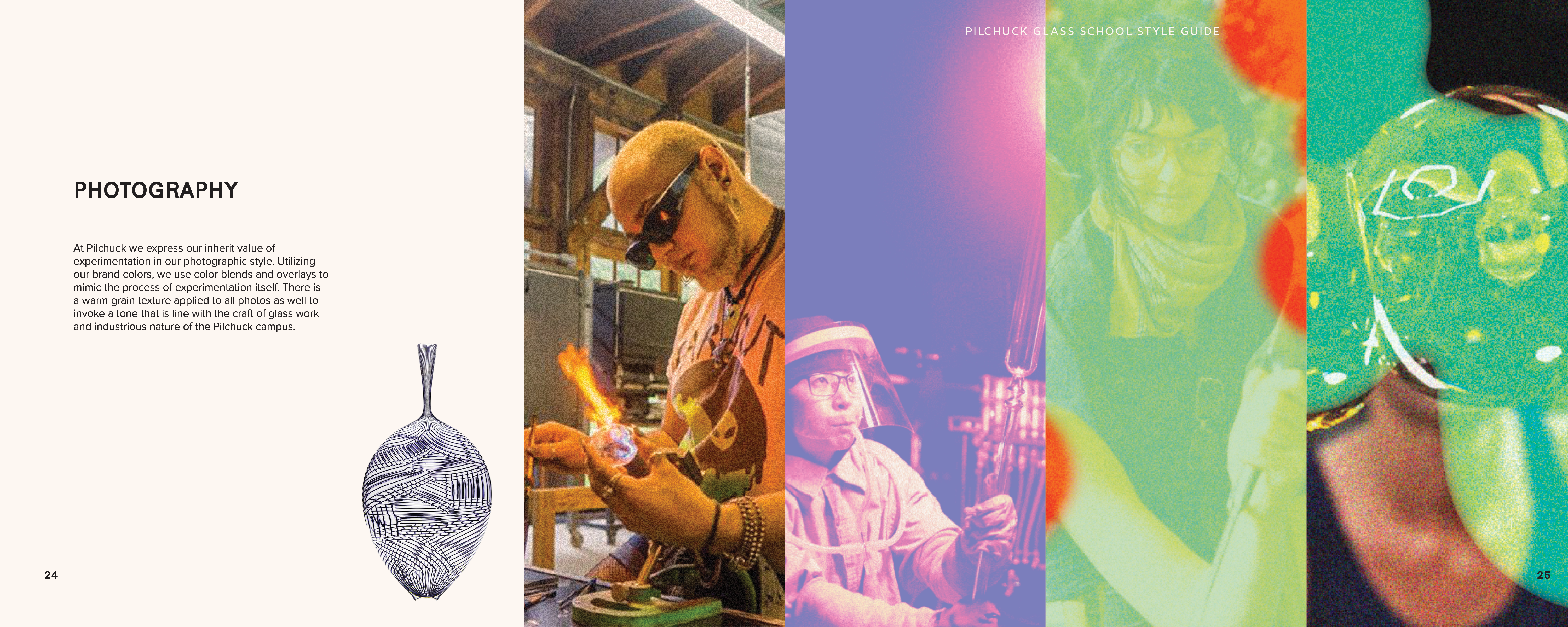
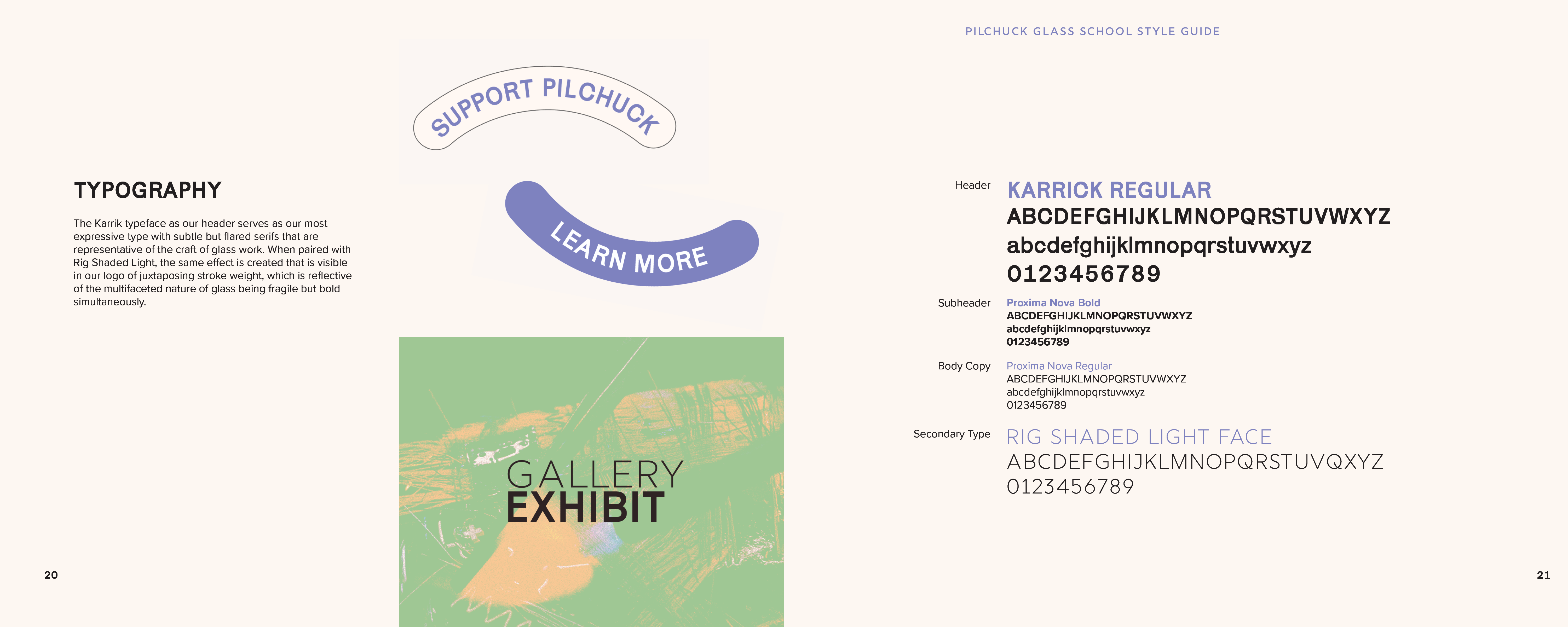
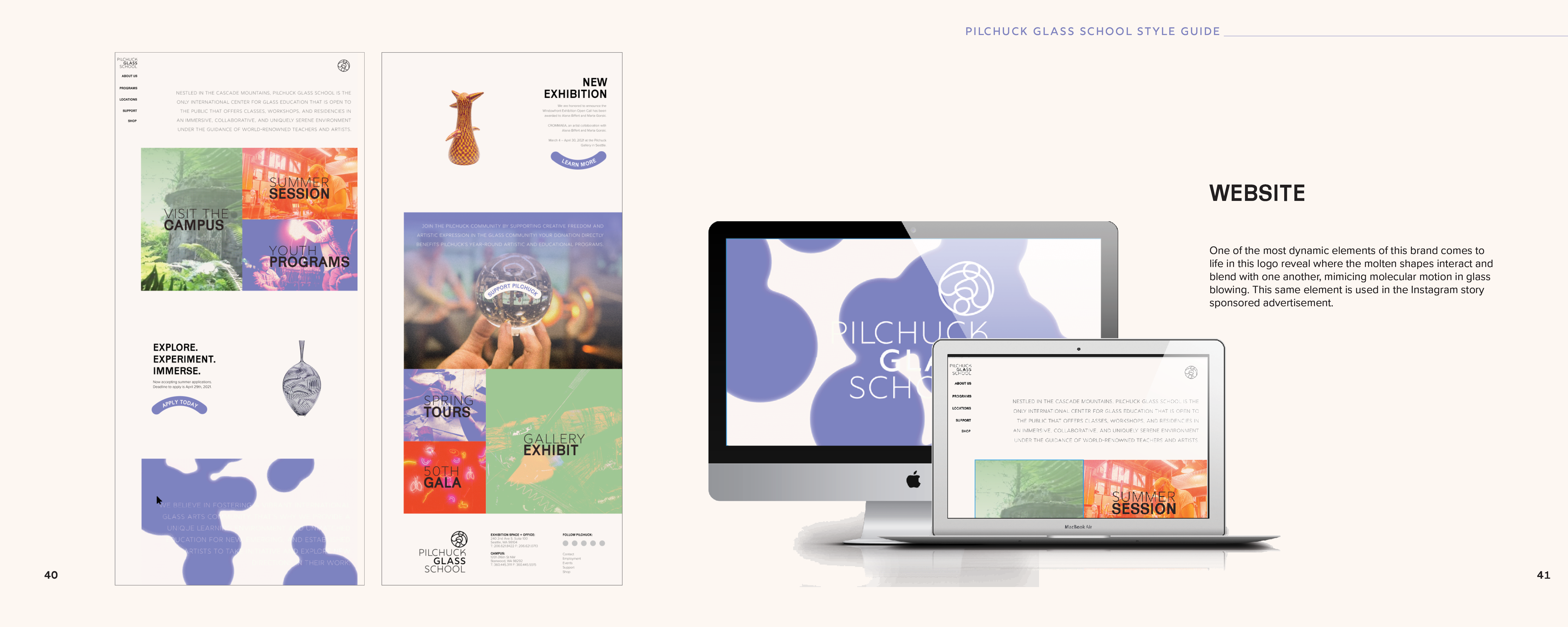
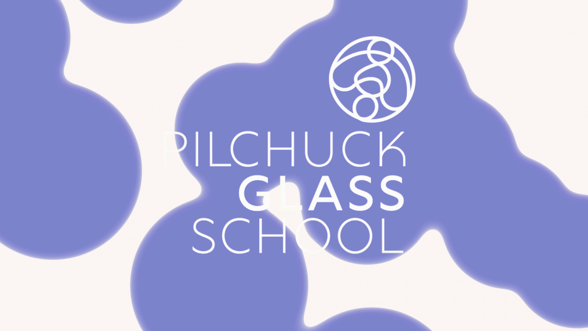
Color, Photography, and Type