


Seattle Public School // Dashboard Redesign
Problem
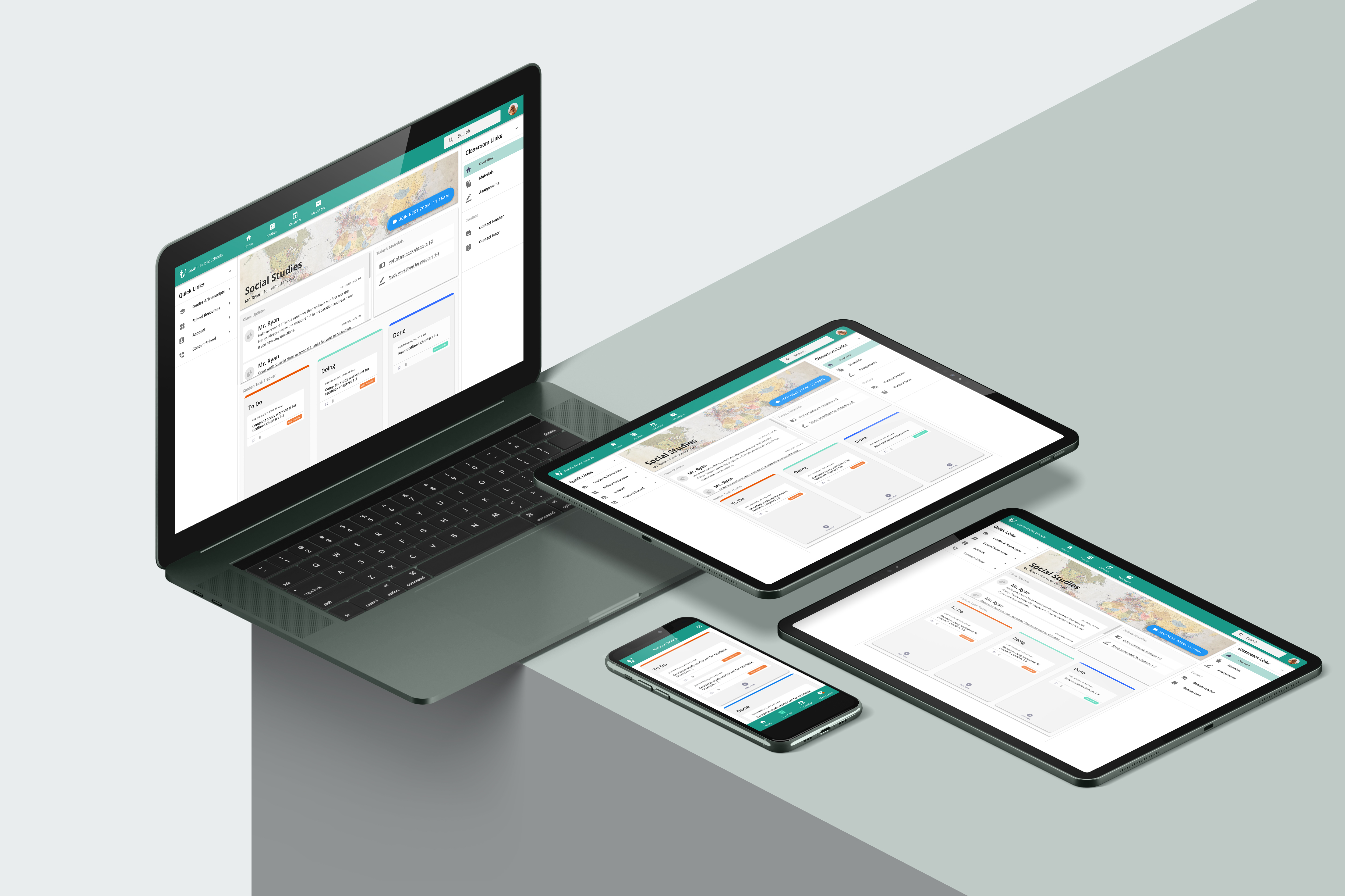
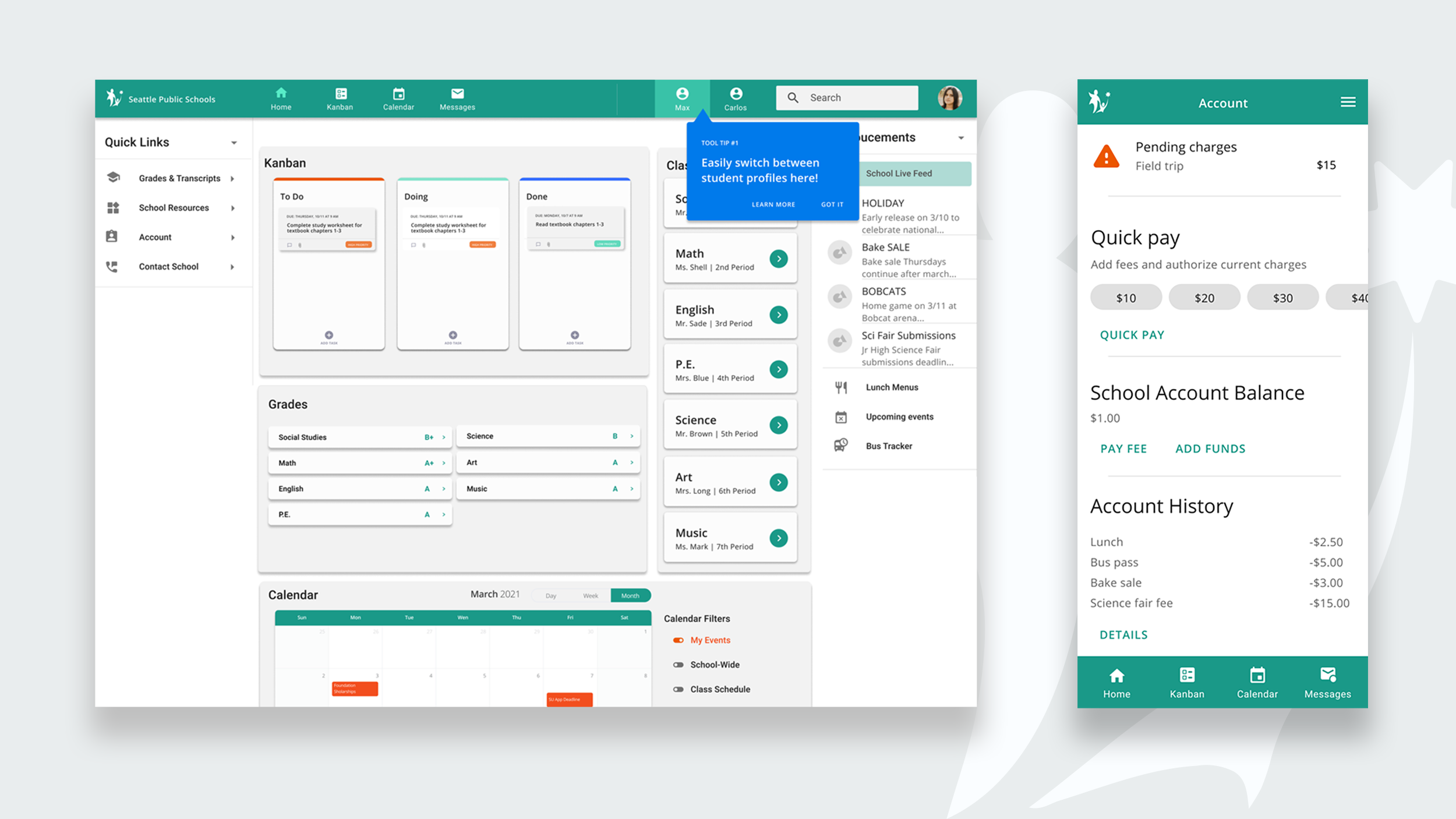
Seattle Public School currently requires students, parents, and guardians to navigate between three separate platforms to accomplish simple everyday tasks. How might we streamline this platform while creating a cohesive, unified, inclusive, and human-centered experience for all users?
Solution
By being empathetic towards the user and taking a human-centered approach to the design process, we were able to deeply understand their needs, and create a solution that is accessible by the diverse communities that the Seattle Public School serves
Skills
Research, UI/UX Design & Product Design
Research, UI/UX Design & Product Design
Timeframe
12 weeks
12 weeks
Collaborators
Heather Manning & Kato Toombs
Heather Manning & Kato Toombs
Tools
Figma, Miro & Illustrator
Figma, Miro & Illustrator
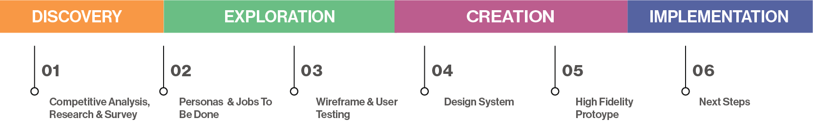
Timeline
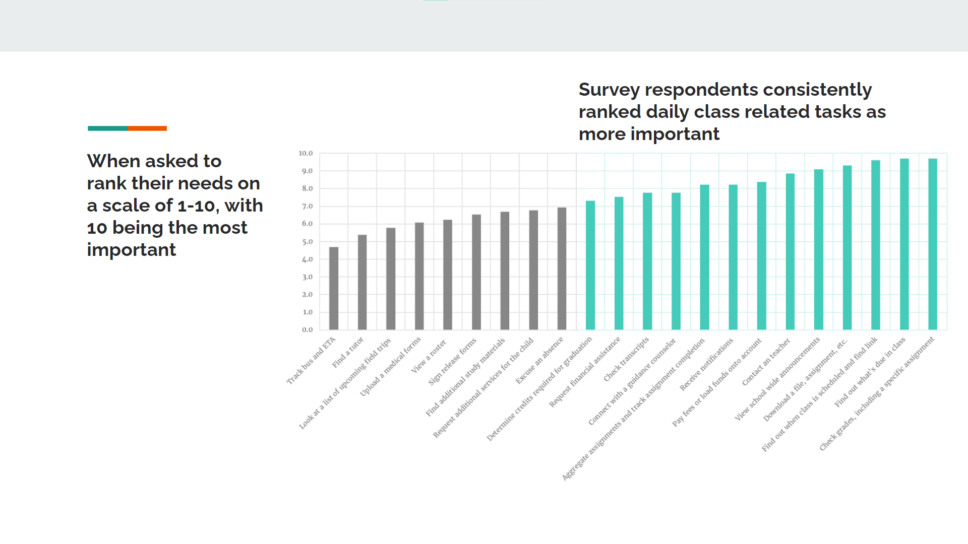
Survey
By surveying and interviewing, we can empathize with our users, determine their key pain points, and prioritize solutions that will have a larger impact.
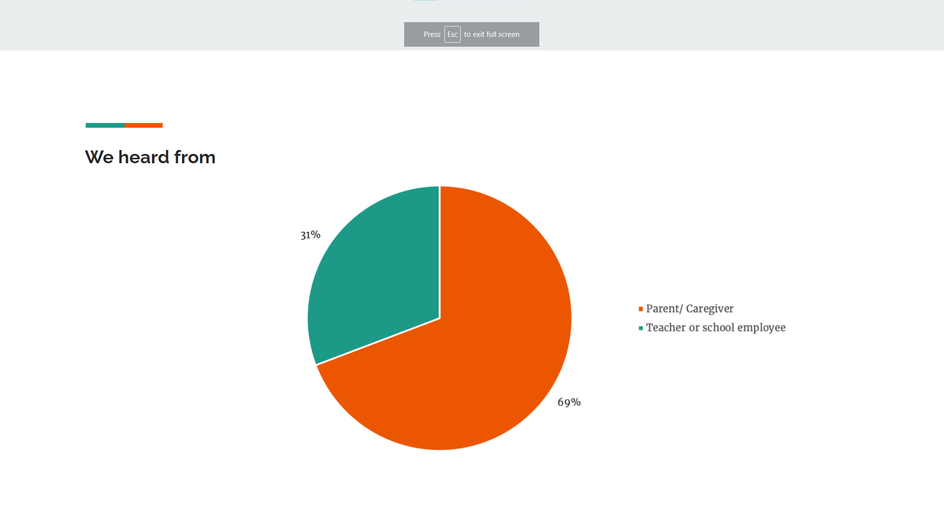
“With everything being digital now, having to save edit, re-save, and then upload documents on multiple different platforms is just too much for elementary kids. They are both frustrated and shutting down. They aren’t learning anything.”
Site Audit
To understand the project’s full scope, we decided to audit the three platforms users were interacting with to accomplish tasks within this complex infrastructure. We then used this information to determine the jobs to be done by our product.
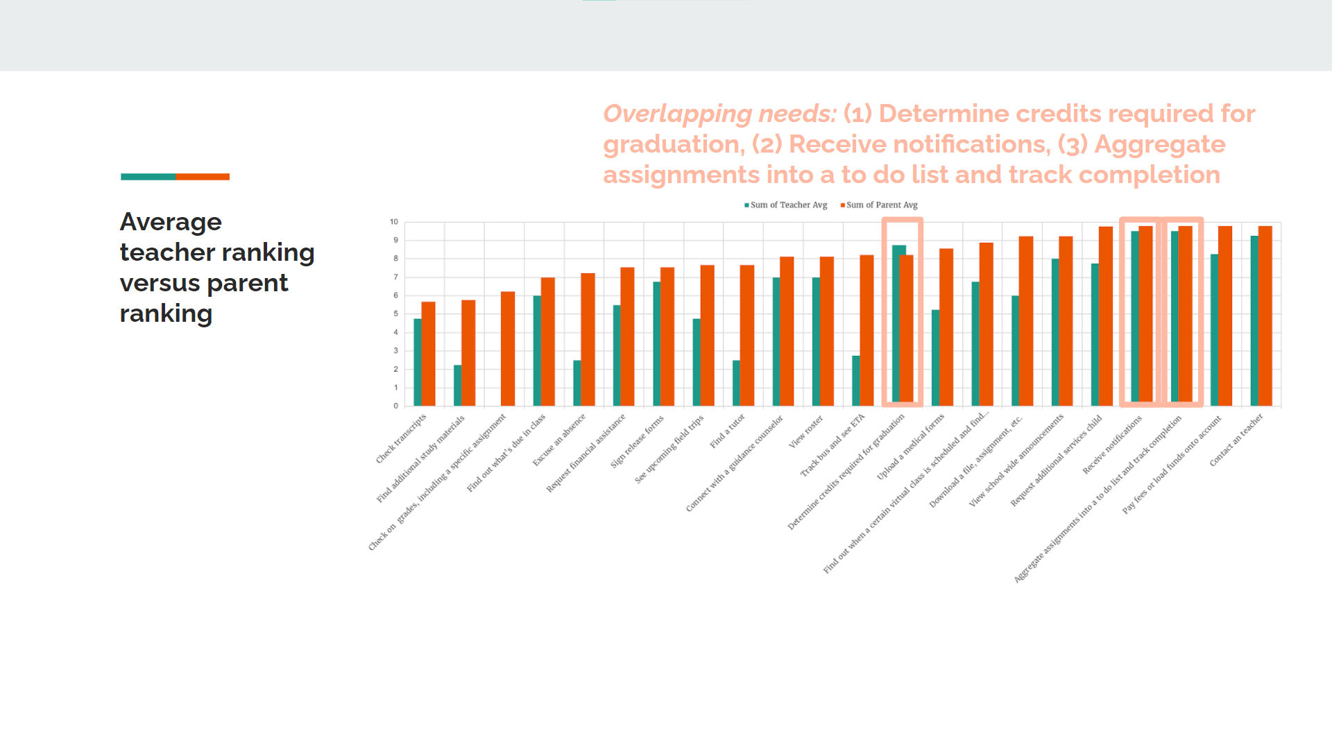
Impact MatrixIn order to focus our efforts we used the lens of an impact matrix. We began to Prioritize tasks that had the most value to the user that also had a direct path to completion.


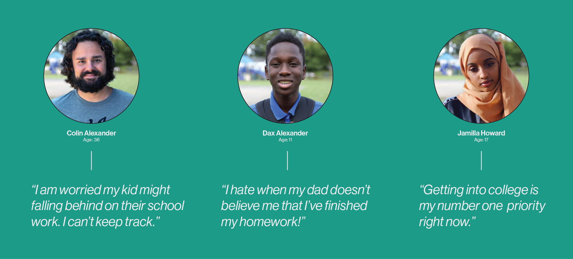
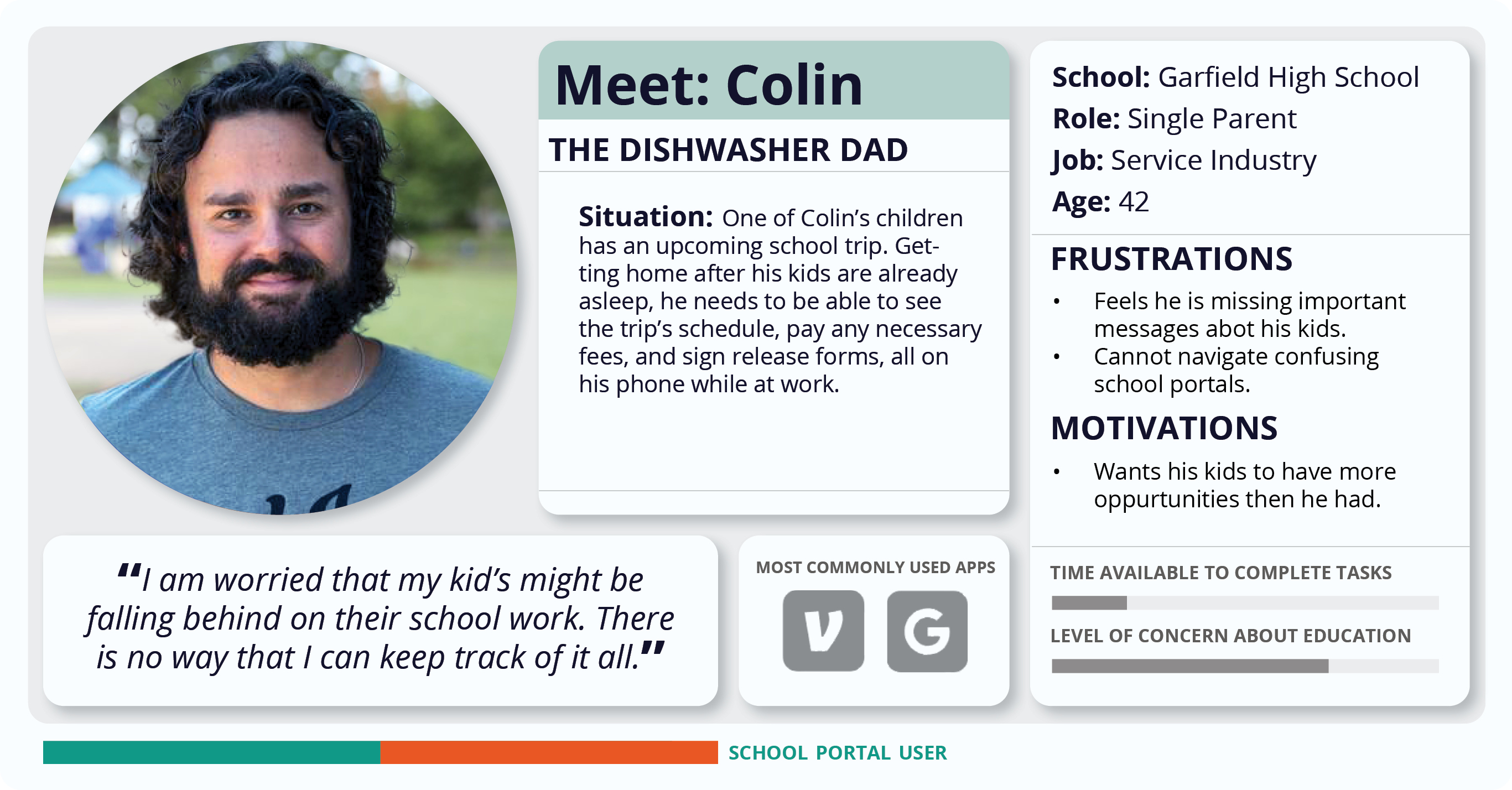
Persona
We distilled our qualitative and quantitative data into user personas to ensure that our small team was designed with the user in mind. It was also helpful to explain the reasoning behind our solutions later when we were presenting to stakeholders.
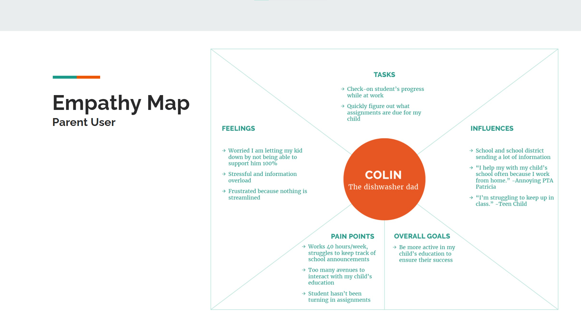
Empathy Map
In order to further peel back the layers of our persona, and add more depth that would resonate with our team, we created empathy maps. Empathy maps are a powerful part of a UX designer’s tool kit, however they are only as robust as the data you are inputting.
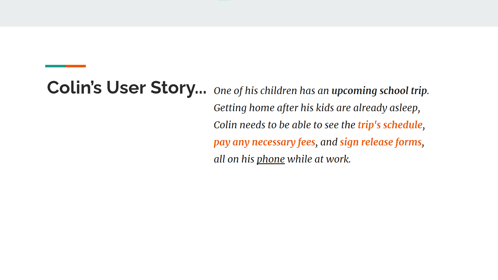
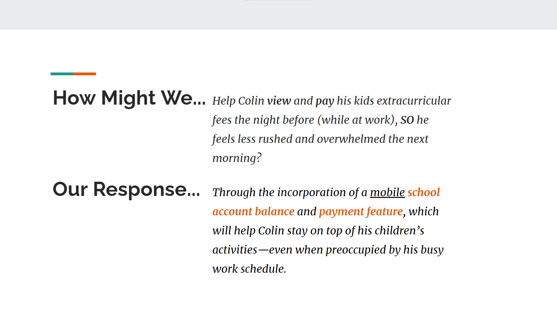
How Might WeWe used our user stories to determine the tasks flows that we would focus on for our initial prototype. Then by usiung “how might we” statements we were able to brainstorm and dig a bit deeper into solutions that were less obvious.
Design System
By using Material IO, we ensured that our design was accessible and that the interfaces were within the user’s existing mental model. We wanted to ensure that the design system took an atomic approach and had color hierarchy and contrast.

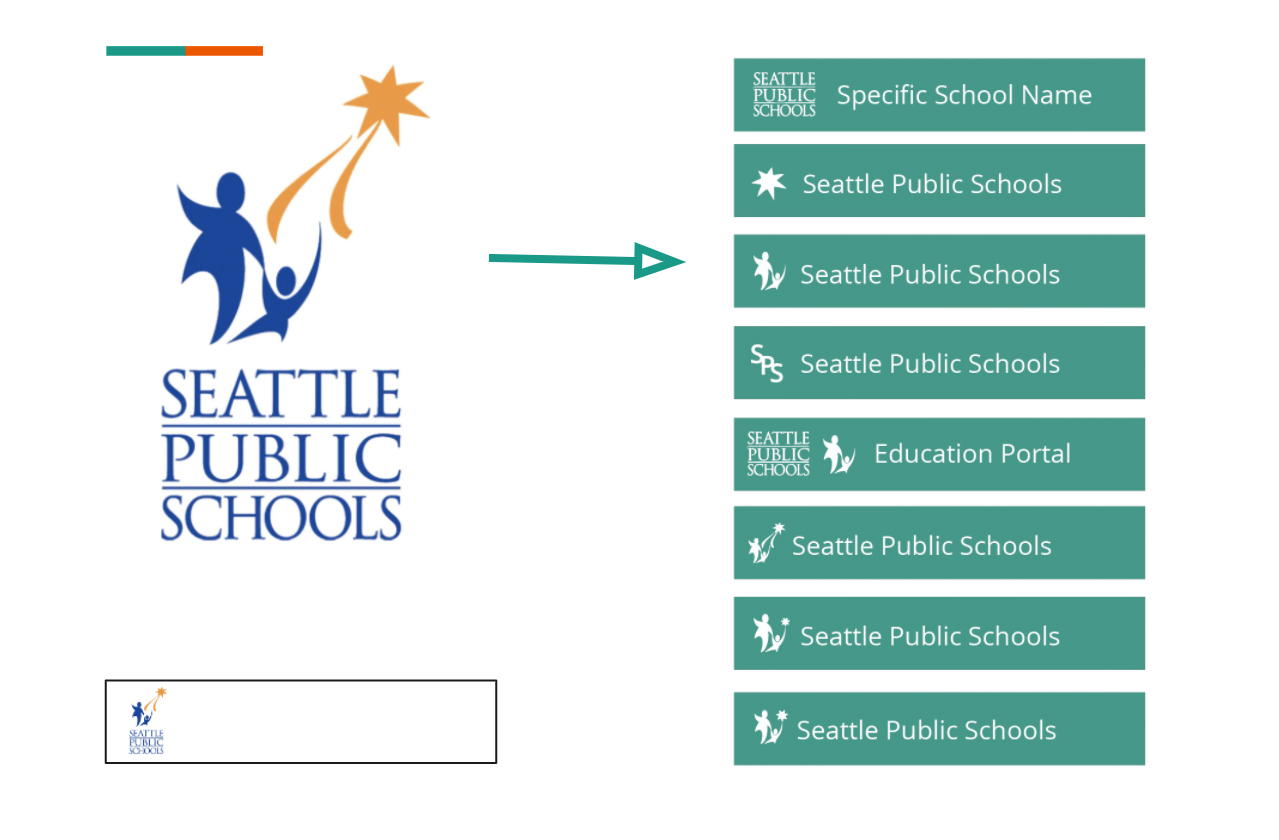
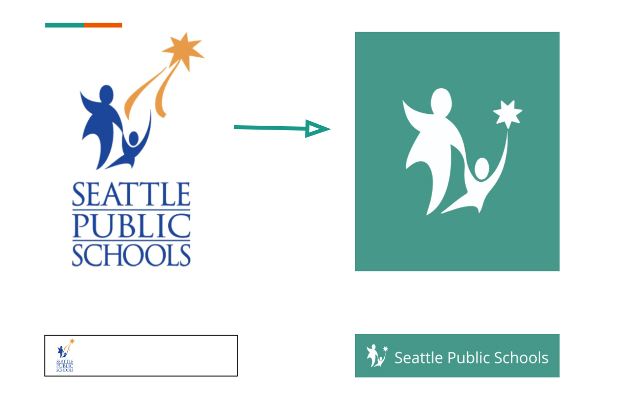
Logo Adaptation
While designing, we intentionally kept the Seattle Public School’s Branding. However, the logo was not optimized for mobile screens, and minor yet adjustments needed to be made. I simplified the logo, while keeping it recognizable. It was also important to keep the heart of the story intact.
While designing, we intentionally kept the Seattle Public School’s Branding. However, the logo was not optimized for mobile screens, and minor yet adjustments needed to be made. I simplified the logo, while keeping it recognizable. It was also important to keep the heart of the story intact.